Lithuanian Vodka Gold Vodka Packaging Design by Studija Creata |
Home > Winners > #39586 |
 |
|
||||
| DESIGN DETAILS | |||||
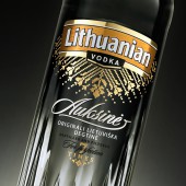
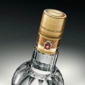
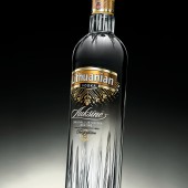
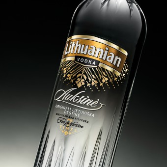
| DESIGN NAME: Lithuanian Vodka Gold PRIMARY FUNCTION: Vodka Packaging Design INSPIRATION: The infinite treasury of Lithuanian national heritage. Sun beams playing on the drops after the rain. Wide gamut of delicate golden undertones. UNIQUE PROPERTIES / PROJECT DESCRIPTION: Purity and clarity, the main properties that reflect a vodka's quality, were emphasized while rebranding Lithuanian Vodka Gold - the vodka market leader in Lithuania. At the same time some features of national identity were introduced to communicate the Lithuanian Vodka name itself. Authentic ethnic motives transformed into a new uncluttered composition. Once the massiveness of the old label was destroyed to create a light, perforated decor, the gold began to shine in a much more elegant manner. OPERATION / FLOW / INTERACTION: Pure and clear label design communicates the same properties of the product. PROJECT DURATION AND LOCATION: "Lithuanian vodka Gold" was updated in 2014. FITS BEST INTO CATEGORY: Packaging Design |
PRODUCTION / REALIZATION TECHNOLOGY: Glass bottle, transparent label and flexographic print. SPECIFICATIONS / TECHNICAL PROPERTIES: Capacity: 700 ml. Dimensions: 72 (w) x 295 (h) mm. TAGS: Lithuanian, vodka, gold, transparent, ethnographic, modern, design, Stumbras, Studija Creata RESEARCH ABSTRACT: Lithuanian Vodka is the most popular vodka brand in the country, therefore consumers were highly addicted to the former look of the product. As the label was to be changed significantly, to retain recognition of the product certain links to the previous design had to be found. The former shield-shaped label was split into several repetitive elements reminiscent of the same shape. Perforated decor destroyed the massiveness of large foil area, meanwhile the scattered reflections make the label not less golden. CHALLENGE: Besides the advantages they give, transparent labels create some obstacles: foil looks plane, embossing is impossible, tiny elements on transparent background might be less visible on the market shelves. Numerous proof prints were done, varying lacquer components and different foils, to achieve expressive and prosperous result. ADDED DATE: 2015-02-24 17:25:06 TEAM MEMBERS (2) : Asta Kauspedaite (Designer, "Studija Creata") and Jurate Paulauskiene (Head of Product development department, "Stumbras") IMAGE CREDITS: Edgaras Marozas |
||||
| Visit the following page to learn more: http://www.creata.lt | |||||
| AWARD DETAILS | |
 |
Lithuanian Vodka Gold Vodka Packaging Design by Studija Creata is Winner in Packaging Design Category, 2014 - 2015.· Press Members: Login or Register to request an exclusive interview with Studija Creata. · Click here to register inorder to view the profile and other works by Studija Creata. |
| SOCIAL |
| + Add to Likes / Favorites | Send to My Email | Comment | Testimonials | View Press-Release | Press Kit |


