DESIGN NAME:
Margan-Field Blend
PRIMARY FUNCTION:
Wine label
INSPIRATION:
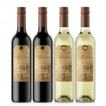
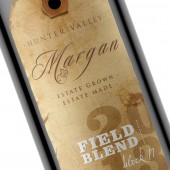
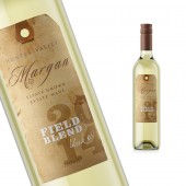
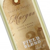
We looked at luggage tags and letter press typography for inspiration. We wanted the label to have a purity of expression and the tag style fitted this thinking. The label was to have only the most basic and yet critical information on it, as would a luggage tag. We gave the label an aged look to reflect the heritage of this type of grape growing. The information heirarchy was established through both typography and print finishes.
UNIQUE PROPERTIES / PROJECT DESCRIPTION:
The brief: Create a label that reflects the former way of grape growing, growing a number of varietals in the same vineyard, the blend is whatever nature gives that vintage. Our solution: Create a label with an earthy, natural quality using an old style luggage tag visual. The stock, Cotone Bianco Ultra, perfect for its tactile quality. The finishes, embossing and high build varnish used to maximise visual impact. The solution aligns with the brand positioned as innovative in its viticulture.
OPERATION / FLOW / INTERACTION:
There is nothing new about the bottle or its closure, quite the contrary is is very traditional, what is different is the approach to the viticulture that is then reflected in the label design.
PROJECT DURATION AND LOCATION:
The project was started in Sydney, Australia in May 2014 and completed in July 2014.
FITS BEST INTO CATEGORY:
Packaging Design
|
PRODUCTION / REALIZATION TECHNOLOGY:
The image detail was critical to the production of this label. The stock needed to give a sumptuous tactile quality and bulk. Cotone Bianco Ultra was selected for its 100% natural cotton composition as it often has slight variation in tone and appearance which supported the brand proposition of being of nature or natural. The print needed to look natural as well so we avoided using foils but instead kept the colour palette earthy and used white type with clear high build to give us definition and prominence.
SPECIFICATIONS / TECHNICAL PROPERTIES:
The labels were initially digitally printed then moved to offset for finishing and die cutting. The stock, Cotone Bianco Ultra 140gsm, gives the label great bulk and durability. The print is CMYK plus one PMS with embossing and high build finishes and die cutting. The front label is 60mm wide and 120mm high, common to both white and red as the bottles are both the same size. The back labels are 64 mm wide and 106mm high.
TAGS:
Wine, wine packaging, beverage packaging, label design, wine label design, wine label packaging
RESEARCH ABSTRACT:
There aren't many field blends currently in the market, so there isn't a strong visual language established. We felt there was an opportunity to explore material usage and illustrative typography and draw on elements from older style labels for the visual direction. We focused on simplicity and clarity of positioning.
CHALLENGE:
The most critical challenge was the short design and production lead time. The project had just an eight week turn around before bottling. This gave little time for the production challenges, one of which was the task of removing the diecut circle of paper from the label at the top when stripping after diecutting.
ADDED DATE:
2014-09-28 20:01:24
TEAM MEMBERS (1) :
IMAGE CREDITS:
Angela Spindler, 2014.
|
