Visual Culture Optical Central Hong Kong Retail by OFT Interiors |
Home > Winners > #35867 |
 |
|
||||
| DESIGN DETAILS | |||||
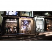
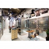
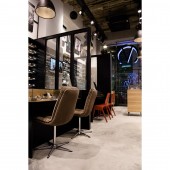
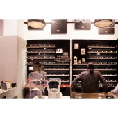
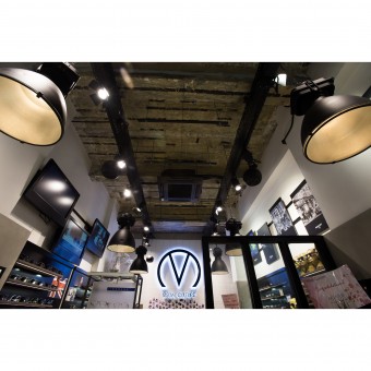
| DESIGN NAME: Visual Culture Optical Central Hong Kong PRIMARY FUNCTION: Retail INSPIRATION: Glasses are one of industrial products that are made for practically optical needs, in the same time, glasses also present kind of incidentally beauty, they have artistic ambience contained within rational purpose. The Central branch of Visual Culture Optical, the spectacles boutique, has been utilized its interior design to envisage this kind of extraordinary connection between two extreme characteristics. UNIQUE PROPERTIES / PROJECT DESCRIPTION: The ceiling height of the site is high enough to build up to two levels, which is quite rare for Hong Kong, thus the designer has maximized the openness of the whole shop from the ceiling by applying full height glass door and glass display windows. The gigantic logo signage that is hanged on the ceiling behind the display window, along with the smaller wordings of the name stuck on glass, the main subject of the shop has been exhibited here clearly without blocking the great view inside. As well, the spacious environment has been maximized by utilizing of the high ceiling too. OPERATION / FLOW / INTERACTION: While looking around the shop, all the furniture and joinery seem like just randomly placing in the interior, indeed this setting is capable to play a tune of harmony throughout the space, then the tune could being passed to customers’ hearts by a language called “glasses”. PROJECT DURATION AND LOCATION: This project started in Nov, 2013 and finished in Jan 2014, located at Central, Hong Kong. FITS BEST INTO CATEGORY: Interior Space and Exhibition Design |
PRODUCTION / REALIZATION TECHNOLOGY: Concrete finishes/ Wood/ Stainless Steel/ Zinc plate/ Mirror/ Tiles/ Lamps acquired from Britain/ Vintage furnitures SPECIFICATIONS / TECHNICAL PROPERTIES: 52sqm TAGS: retail, interiors, glasses, vintage furnitures, black steels, concrete RESEARCH ABSTRACT: Previously, the design theme of the shop’s Central upstairs branch was totally white, then the new shop site would adopt a more variable design theme with those two totally difference between the “two poles” of glasses images. CHALLENGE: - ADDED DATE: 2014-07-25 03:59:18 TEAM MEMBERS (2) : CM Jao and Ken Cheung IMAGE CREDITS: Images : OFT Interiors, 2014. |
||||
| Visit the following page to learn more: http://www.oftinteriors.com/ | |||||
| AWARD DETAILS | |
 |
Visual Culture Optical Central Hong Kong Retail by Oft Interiors is Winner in Interior Space and Exhibition Design Category, 2014 - 2015.· Press Members: Login or Register to request an exclusive interview with OFT Interiors. · Click here to register inorder to view the profile and other works by OFT Interiors. |
| SOCIAL |
| + Add to Likes / Favorites | Send to My Email | Comment | Testimonials | View Press-Release | Press Kit |

