Emperor UA Sparks Cinema by OFT Interiors |
Home > Winners > #35851 |
 |
|
||||
| DESIGN DETAILS | |||||
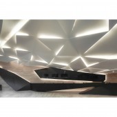
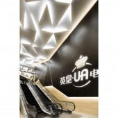
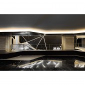
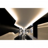
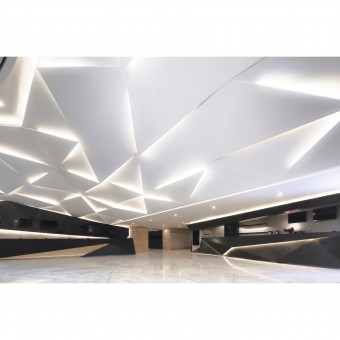
| DESIGN NAME: Emperor UA Sparks PRIMARY FUNCTION: Cinema INSPIRATION: When it is about movie, people would tend to provoke heaps of connections and imaginations of it. The extravagance in palace of Tang Dynasty in Curse of the Golden Flower, the tranquility of bamboo forest in Crouching Tiger Hidden Dragon, the bustle of old Hong Kong streets in The Echoes of the Rainbow, and all kinds of stories and emotions within the many scenes are all illustrated by the broad and blank 16:9 screens in theatres. A cinema ought to have all these different personalities within oneself, as the appreciation of movies is never limited to the boundary of screens. UNIQUE PROPERTIES / PROJECT DESCRIPTION: The light that penetrates from the skylight on Vivo City at Foshan has lit up the bright view that is decorated by plainly black and white tones. The very first Emperor UA cinema has debuted under such a delightful scene, which foresees the cinema’s future path in China. Just as scattered pieces in kaleidoscope, the ceiling modules with triangle and rhombus patterns are letting light beams into the cinema, the first impression of the dazzling space has been started up as well. With the same rule of geometry, stainless steel strips are dissecting the white marble floor and reflecting the scene of flying paper pieces from ceiling to floor. From the shopping centre to the cinema, we go through layers of eye-dazzling fixtures; waves of juvenile feelings hit us all the way. The thesis of the design project is to carry out the infinite novelty of movies by design theme with sci-fi sensation. OPERATION / FLOW / INTERACTION: What is welcoming customers are irregular shaped structures made of black oak timber strips. One of tips of this polyhedron has extended and leading customers to the ticket box counter with similar appearance that is adjacent to it. The counter has punched out from ceiling then excessively merged with the TV screen behind where staffs stand, the fixture has exposed designer’s ambition on the forms and shapes in this project. Walking pass another set of luxurious and motional concession counter, on the far side of the lobby, there is the escalators area to theatres upstairs. Inheriting the dark-and-light-contr PROJECT DURATION AND LOCATION: This project started in Sep, 2013 in China and finished in June 2014, inside the shopping mall Vivo City, Foshan in China. FITS BEST INTO CATEGORY: Interior Space and Exhibition Design |
PRODUCTION / REALIZATION TECHNOLOGY: Stone/ Wood/ Steel/ Acoustic Panel/ Carpet/ Fabric/ Glass/ Mirror/ Tiles SPECIFICATIONS / TECHNICAL PROPERTIES: 6,034sqm TAGS: cinema, entertainment, retail, public, origami, interiors, kaleidoscope, sparks RESEARCH ABSTRACT: This project continued with the imagination of the movies, for the experiences of audiences from entering the cinema, in terms of forms and flexibilities created by origami and kaleidoscope all over the ceiling and envelope, representing the great joint venture of our clients. CHALLENGE: There are always difficulties working with the structure, while designing a cinema project in a shopping mall. We solved the embarrassing ceiling level differences with the design, also applied the design though out the cinema. Acoustics is one of the most important part as well. We considered the design as our package of cinema's experience. For all the materials we chose for the design, as well as the pattern and the forms of feature wall lights, are fulfilling the requirements for the best acoustics. We work closely with different consultants for projects, test together with the clients and consultants so as to listen, test and provide the best solution as a linkage between consultants and clients. ADDED DATE: 2014-07-24 02:54:03 TEAM MEMBERS (2) : CM JAO and KEN CHEUNG IMAGE CREDITS: Images : Photographer Edmon Leong, 2014. |
||||
| Visit the following page to learn more: http://www.oftinteriors.com/ | |||||
| AWARD DETAILS | |
 |
Emperor Ua Sparks Cinema by Oft Interiors is Winner in Interior Space and Exhibition Design Category, 2014 - 2015.· Press Members: Login or Register to request an exclusive interview with OFT Interiors. · Click here to register inorder to view the profile and other works by OFT Interiors. |
| SOCIAL |
| + Add to Likes / Favorites | Send to My Email | Comment | Testimonials | View Press-Release | Press Kit |

