Zen Resort & Spa Sales Center Sales & Exhibition by Raynon Chiu |
Home > Winners > #35716 |
 |
|
||||
| DESIGN DETAILS | |||||
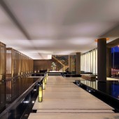
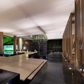
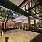
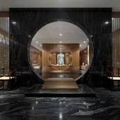
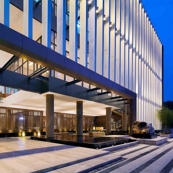
| DESIGN NAME: Zen Resort & Spa Sales Center PRIMARY FUNCTION: Sales & Exhibition INSPIRATION: No extravagant decoration,but concise and delicate.Moreover,it emits conventional confidence and charm anywhere. This is the most distinguishing feature of the project for this time. It’s located in geomantic and treasured site of Yichun City and possesses absolute advantage dominantly in geography.It’s close to Xiujiang Garden Residential Area on the west,adjacent to Royal International Mansion on the east,facing the Huacheng Wetland Park on the south.This center used to be a seafood restaurant which had been running for many years.Certain reason can account for the dismissal of this restaurant in here.You could well tell by entering into the dining room on the back hall.This center would be considered as re-use of an old building rather than construction of new one,which took advantage of sufficiently ability of creation and recycling of space of the designer.The selected site of this center also determinates positioning of the housing property and aimed customers.It would help positively by making gimmicks to some extent. “Interior is extension of architecture”,whic UNIQUE PROPERTIES / PROJECT DESCRIPTION: The location of this project is located in a place where old Chinese culture is treasured and protected very well simultaneously.Compl OPERATION / FLOW / INTERACTION: To build a whole new bulding on the existing site after dimissing the old one appears impossible for the client,regarding no matter on the duration of progressing or on the limited budget.Proper addition of external facets of the old building and redivision of internal spaces become the greatest challenge for the designer.The philosophy generated in the designer's mind was to make a spiritual establishment which reprerents traditional culture to the best by using the most fundamental elements like straight lines.The most exciting place for this center is that the designer ultilized certain way to simplify intricate Chinese symbols into a kind of purity and sence of spatial blank. PROJECT DURATION AND LOCATION: The project started in October 2013 and finished in April 2014 in Yichun of China,and was opened to the public in there the the same month. FITS BEST INTO CATEGORY: Interior Space and Exhibition Design |
PRODUCTION / REALIZATION TECHNOLOGY: Main Materials: Wood Grain Marble, Grey Granite Marble, Shanxi Black Marble, Hyatt Beige Marble, Elm, Ashtree, Texture Wood, Wallpaper, Cloth, Leather, Latex Paint, Metal, Carpet. SPECIFICATIONS / TECHNICAL PROPERTIES: Dimension of this project is 35.58X52.32X16.49(Me TAGS: Sales Center,Chinese Zen,Re-use. RESEARCH ABSTRACT: As a Taiwan-born interior designer who has an appropriate understanding to China with a long history and culture and knowledge of state-of-the-art technology,it is his biggest wish to spread new idea to this field.The main designer and fellows came down to the earth and talked with local people over there in order to get to know their humanities.The local people have their own sense of aesthetics and irrevocable habits,thus the designer complied with these principles to embark on the scheme.Lighting system is predominatedly highlighted in the whole process,which must merge very well with the surroundings.Due to the location of the project-residential zone along Huacheng Wetland Park,the designer didn't hope that this center be bright and colourful rather than be quiet and steady. CHALLENGE: The hardest part of this design for the designer was how to leave out needed space for waterscape catered as interim connecting the external and internal.Started from this angle,the designer drew back certain measured spaces from interior to make a waterspace.In that case,interior space became smaller than it's used to be,which more or less had some compact on main space. ADDED DATE: 2014-07-02 03:02:00 TEAM MEMBERS (1) : Eric Zhang,Luo Hui,Li Junwei. IMAGE CREDITS: Image #1-#5:Photographer Dabin,variations,2014. |
||||
| Visit the following page to learn more: http://internationaldesignexcellenceawar |
|||||
| AWARD DETAILS | |
 |
Zen Resort & Spa Sales Center Sales & Exhibition by Raynon Chiu is Winner in Interior Space and Exhibition Design Category, 2014 - 2015.· Press Members: Login or Register to request an exclusive interview with Raynon Chiu. · Click here to register inorder to view the profile and other works by Raynon Chiu. |
| SOCIAL |
| + Add to Likes / Favorites | Send to My Email | Comment | Testimonials | View Press-Release | Press Kit |

