A and Partners Interior Design by Alvin Jo and Anson Ng |
Home > Winners > #35663 |
 |
|
||||
| DESIGN DETAILS | |||||
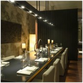
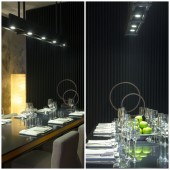
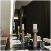
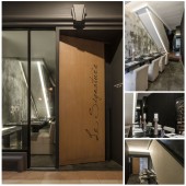
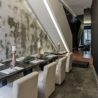
| DESIGN NAME: A and Partners PRIMARY FUNCTION: Interior Design INSPIRATION: The hectic city life is already complicated and packed with too many marketing ideas. Advocating designs that are simple and minimal form the cornerstone of A and Partners’ design philosophy, where it inspires use of basic elements and materials derived from nature. Through the use of basic elements, the harmonizing of materials that are disparate in qualities such as wood and steel within the same environment is our design endeavour to create the balance of calmness amid the bustling city life. UNIQUE PROPERTIES / PROJECT DESCRIPTION: The existing staircase which was occupying 25% of the space was transformed to be the main sculpture of attraction. Coated flat metal bar was used to finish up the railing, showcasing a simple yet sophisticated detail. On the upper level, there are tables set for group dining and private dining. To achieve privacy, the metal finished communal table was placed away from the private dining to give a theatrical appearance to the narrow space available. OPERATION / FLOW / INTERACTION: The area of this restaurant may be humble but through use of glass, mirrors, natural lights, natural materials and light colours we were able to create a warm yet formal setting. Once inside, the restaurant feels roomy and not too tight. PROJECT DURATION AND LOCATION: This renovation was completed in 60 days in Jakarta, Indonesia. FITS BEST INTO CATEGORY: Interior Space and Exhibition Design |
PRODUCTION / REALIZATION TECHNOLOGY: - SPECIFICATIONS / TECHNICAL PROPERTIES: This restaurant occupies 14mx6m space and has two storeys. It can accommodate 35 seated guests or 50 standing guests. Level 1 can host 10 people and level two can host 25 people. TAGS: interior, minimalist, small space, restaurant, conversations, formal, corporate RESEARCH ABSTRACT: This space was previously a shop house and our client required this space to be renovated into a formal restaurant. Our design philosophy is to use natural locally sourced materials and keep the design simple and minimal. Since this place was very small in terms of area we wanted to get in as much light as we could and also use light coloured materials. Therefore, timber and bare concrete were our materials of choice. That combined with lots of tinted mirrors and making use of functional features such as the staircase for aesthetic purposes helped in creating a pleasant atmosphere and also helped gratify our creative needs. CHALLENGE: We had to plan for dining, kitchen and service area within a small sensitive zone which was a herculean task. A metal screening was placed at the right angle along the 1st floor entry to achieve a better depth in narrow space. Tinted mirror was carefully used on the wall adjacent to the staircase, thus creating a symmetrical vision. ADDED DATE: 2014-06-30 06:41:27 TEAM MEMBERS (1) : Alvin Jo and Anson Ng IMAGE CREDITS: Visual Studio Singapore Pte Ltd |
||||
| Visit the following page to learn more: http://www.aandpartners.com | |||||
| AWARD DETAILS | |
 |
A and Partners Interior Design by Alvin Jo and Anson Ng is Winner in Interior Space and Exhibition Design Category, 2014 - 2015.· Press Members: Login or Register to request an exclusive interview with Alvin Jo and Anson Ng. · Click here to register inorder to view the profile and other works by Alvin Jo and Anson Ng. |
| SOCIAL |
| + Add to Likes / Favorites | Send to My Email | Comment | Testimonials | View Press-Release | Press Kit |

