Treboom brewery beer range Beer Packaging Design by United by Design |
Home > Winners > #35648 |
 |
|
||||
| DESIGN DETAILS | |||||
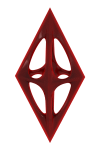
| DESIGN NAME: Treboom brewery beer range PRIMARY FUNCTION: Beer Packaging Design INSPIRATION: The concept of the bottle labels is to tell a story in a simplified and entertaining way, with a central focal point in each design. Taking inspiration from totem poles we created bespoke illustrations. A repeat pattern is woven into it that brings a further dimension that is relevant to the story. The personality of each ale comes to life whilst creating a range that has a distinct look and feel. The designs enable us to extend the collection to special edition ale such as the 'Maillot Blanc'. UNIQUE PROPERTIES / PROJECT DESCRIPTION: The business needed bottle labels as it was making the transition from producing cask ales to bottling. Labels were needed that would survive in a range of wet cold and hot conditions. Paper labels were not an option so plastic had to be used. We worked on a range of labels that used varnishes and print to simulate a textured paper label. Matt and reticulated varnishes on top of the 3 colour spot Pantone colours were used to create texture and vibrancy on shelf and in the consumers hand. OPERATION / FLOW / INTERACTION: Each label has two textured varnishes on the label material to give a more memorable and engaging experience that emulates paper. PROJECT DURATION AND LOCATION: Project start date: April 1st 2013 Project launch date: September 19th 2013 Project duration: ongoing FITS BEST INTO CATEGORY: Packaging Design |
PRODUCTION / REALIZATION TECHNOLOGY: Glass bottle with 2 x printed PET 'plastic' labels with 3 spot Pantone colours, Matt varnish to black and reticulated varnish to main label colour. SPECIFICATIONS / TECHNICAL PROPERTIES: Core range of beers: 500ml Special edition beer (Maillot Blanc): 750ml TAGS: beer, ale, craft beer, brewery, bottle, design, bottle, packaging, tasting notes, label RESEARCH ABSTRACT: Looking closely at current and historical beer packaging. Analysis of storytelling both in the modern day and past, including tribal influences. Collecting and referencing pattern from interior design, wall paper and print making. Graphic inspiration from 1930's and 1950's CHALLENGE: Create a convincing and seamless link to the brewery brand identity and the new bottle label design. The brewery were happy with their logo so the label design had to connect with the brewery, ensure they did not alienate current consumers but also had to inspired new consumers to make a purchase. The other challenge was to create a label that evoked qualities of a paper using plastic labels. ADDED DATE: 2014-06-30 02:25:10 TEAM MEMBERS (2) : Creative Director: Owen Turner and Designer & illustrator: Ross Brotherston IMAGE CREDITS: ALL: United by Design 2014 |
||||
| Visit the following page to learn more: http://www.treboom.co.uk | |||||


| CLIENT/STUDIO/BRAND DETAILS | |
 |
NAME: Treboom Brewery PROFILE: Treboom is an exciting new microbrewery established in Shipton-by-Beningbrough near York early in 2012. John worked as a research scientist but has hung up his lab coat to pursue his dream of producing great beers, while Jane, a practising ceramicist is keen to bring a creative side to beer making. |

| AWARD DETAILS | |
 |
Treboom Brewery Beer Range Beer Packaging Design by United by Design is Winner in Packaging Design Category, 2014 - 2015.· Read the interview with designer United by Design for design Treboom brewery beer range here.· Press Members: Login or Register to request an exclusive interview with United by Design. · Click here to register inorder to view the profile and other works by United by Design. |
| SOCIAL |
| + Add to Likes / Favorites | Send to My Email | Comment | Testimonials | View Press-Release | Press Kit |
Did you like United by Design's Packaging Design?
You will most likely enjoy other award winning packaging design as well.
Click here to view more Award Winning Packaging Design.
