DESIGN NAME:
Optometry NI
PRIMARY FUNCTION:
Brand Identity and Visual Communications
INSPIRATION:
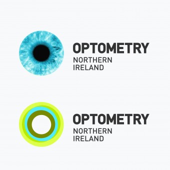
The eye was integral to the brand mark concept. The design needed to be corporate yet memorable. The mark is measured & an authority which challenges us to consider eye health in a memorable way. The design was influenced by considering what an eye is capable of doing & how different our eyes are. How if adjusts for light, focus & reads colour then combining to give layers of information.
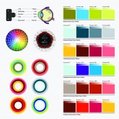
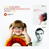
The typography was balanced between the clarity of the font and overlaying lettering in a controlled manner to illustrate vision focus. Colour was used through the typography to build layers within the text to highlight key words and messages that could inform government and health professionals about issues facing eye care in Northern Ireland. It was considered that eye images feel medical and detach the audience from considering how important eye care is to them as an individual, as a result our images communicate a healthy, well balanced lifestyle across the target demographics for the brand. Children with toy glasses although playful raised the question to both parents and government that improper eye care can lead to the need for glasses and result in permanent eye damage.
UNIQUE PROPERTIES / PROJECT DESCRIPTION:
The challenge was to create an authoritative brand mark to communicate issues facing eye care in Northern Ireland to Government, R&D, Optometrists, Hospitals & Patients. The brand mark and visual communications should make us consider eye care & conditions affecting the health of our eyes. The design should communicate the importance of how the eye functions, how visually different they appear and how during our life they will change and encounter different health challenges.
OPERATION / FLOW / INTERACTION:
The identity was created to refresh Optometry NI and give the brand credibility when speaking to health professionals, HNS service, government, R&D industry sector and to the general public. Optometry NI is an authoritative body for Optometry in Northern Ireland and works to better eye care treatments, research and establish links with government to generate policy for eye care in Northern Ireland. The eye mark is designed to allow Optometry NI to create communications tailored to specific sectors from paediatrics to training services for members.
PROJECT DURATION AND LOCATION:
The branding project began 5th July 2013 and the initial stage of the brand rollout was completed end of august 2013. During early september 2013 information packs and awareness literature was created to inform Optometry NI members and to communicate to government and health organisations. Report literature was created to establish Optometry NI as an authority and resource for all matters relating to eye health care. Reports for Age related illnesses, child eye care and eye health awareness was submitted to government in December 2013. There is an ongoing periodical updating and communicating to the various departments of the NHS, Government and members of Optometry NI. For mid 2014 the website resource and online reference guide will be completed.
FITS BEST INTO CATEGORY:
Graphics, Illustration and Visual Communication Design
|
PRODUCTION / REALIZATION TECHNOLOGY:
Litro printing and digital printing of communication literature. Debossing and letterpress report literature. Online communication via ezines and the development of the website.
SPECIFICATIONS / TECHNICAL PROPERTIES:
Corporate identity, Guidelines of use, Stationery Suite, A1 Posters, 48 Sheet, 6 Sheets, A5 Perfect Bound 200pp plus 4pp cover.
TAGS:
Brand, Identity, Eye, Optometry, Northern Ireland, Government, Authority, Research and Development, Medical, NHS
RESEARCH ABSTRACT:
We researched how an eye works, how it translates colour, images, text and also how people have different tones of eye colour from light blue, blue, greyish blue etc. We looked at the ageing effect on eyes and how the eye's ability to focus is affected, how our clarity of colour is changed and it is only through the intervention of an eye care specialist that glasses and other medical procedures can protect, reverse and prolong the health of our eyes.
CHALLENGE:
The challenge was to create a memorable brand identity and experience that involved the eye as a reference point yet somehow deliver something new and exciting that would immediately place the organisation at the pinnacle of the industry. What we also wanted to convey is that the eye faces different challenges through our lifecycle and we wanted to be able to visually refer to this as we communicated to that age group or demographic. As designers we believe that we interpret the world in a visual way, through colour, positioning and we see the subtle layers of a object or design normally missed by the general population - therefore we wanted to create an identity that was artistic, creative, beautiful, representative of an eye, how it works and ultimately encompass everything that we take for granted that our eye and vision gives us on a daily basis.
ADDED DATE:
2014-03-27 05:00:41
TEAM MEMBERS (1) :
Stephen Ferris
IMAGE CREDITS:
Creative Media Team, 2013.
|


