Adria Airways Corporate Identity by Pit Palmer Branding & Identity |
Home > Winners > #34266 |
 |
|
||||
| DESIGN DETAILS | |||||
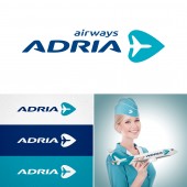
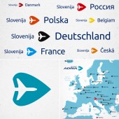
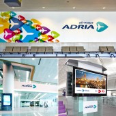
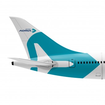
| DESIGN NAME: Adria Airways PRIMARY FUNCTION: Corporate Identity INSPIRATION: The identity of the Adria airways bit obsolete and we wanted to make it better. UNIQUE PROPERTIES / PROJECT DESCRIPTION: This is the concept of the corporate identity of the aviation company. The feature works is that we preserved the main symbols of the Company and added the new one, thus making style is more modern and actual. OPERATION / FLOW / INTERACTION: The basic symbol is used as pointer and arrow and if it's impossible to see company name, it's easy to recognize the Adria's brand. PROJECT DURATION AND LOCATION: The project started in July 2013 and was presented in December 2013 FITS BEST INTO CATEGORY: Graphics, Illustration and Visual Communication Design |
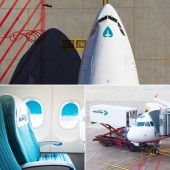
PRODUCTION / REALIZATION TECHNOLOGY: The primary color is one of important tools of identification. Primary color is a color of Adriatic see in sunny day. We call it 'Adria's blue. We use only two colors in body design, simple forms and lot of space. It can decrease a cost of production but save original identity with beauty. Also we are one of pioneers who bring the part of livery to front part of body, above cockpit - it is an important tool that gives a good brand communication when plane is at the gate. SPECIFICATIONS / TECHNICAL PROPERTIES: Livery design: Airbus A319, A320; Bombardier SRJ–200, SRJ–900; uniforms; labels; signs; corporate communication. TAGS: Airline, airways, airplane, slovenia, pointer RESEARCH ABSTRACT: Adria is honored tradition and principles of doing business. Also, Adria is a national carrier and represents whole country — Slovenia, which honored traditions and national values too. We kept valued symbols with care, because it is important for them, leaf of linden and Adria's color. CHALLENGE: The major task is demonstration Adria as a modern and friendly company with 50-years tradition they proud so and keep grows as a part of of new world. ADDED DATE: 2014-03-26 14:47:40 TEAM MEMBERS (1) : IMAGE CREDITS: www.shutterstock.com |
||||
| Visit the following page to learn more: http://pitpalmer.com | |||||
| AWARD DETAILS | |
 |
Adria Airways Corporate Identity by Pit Palmer Branding & Identity is Winner in Graphics, Illustration and Visual Communication Design Category, 2014 - 2015.· Read the interview with designer Pit Palmer Branding & Identity for design Adria Airways here.· Press Members: Login or Register to request an exclusive interview with Pit Palmer Branding & Identity. · Click here to register inorder to view the profile and other works by Pit Palmer Branding & Identity. |
| SOCIAL |
| + Add to Likes / Favorites | Send to My Email | Comment | Testimonials | View Press-Release | Press Kit |
Did you like Pit Palmer Branding & Identity's Graphic Design?
You will most likely enjoy other award winning graphic design as well.
Click here to view more Award Winning Graphic Design.


