SATA Airlines | BIA - Blue Islands Açor Brand Identity by SATA Airlines Brand - Design by Ivity |
Home > Winners > #33956 |
 |
|
||||
| DESIGN DETAILS | |||||
| DESIGN NAME: SATA Airlines | BIA - Blue Islands Açor PRIMARY FUNCTION: Brand Identity INSPIRATION: BIA - Blue Islands Açor. This is the new symbol of SATA. A symbol of the Atlantic sky, a pilot of nature, a bird of the world that makes our ambitions fly higher. The imaginary Açor like no other. (Açor, in portuguese, is the bird that named the archipelago - Açores/Azores). SATA is the most important commercial brand in the Portuguese Atlantic. Its history should not remain static, but instead be supplemented by a new dimension that maintains the visionary spirit that gave rise to it. We are faced with an opportunity to position SATA as the airline that has the best understanding of the Atlantic soul of the Portuguese people. Flying since 1947, the new SATA brand expresses a supra-Azorean challenge. UNIQUE PROPERTIES / PROJECT DESCRIPTION: The new SATA symbol represents the nine islands of the Azores, united in a single Atlantic challenge. 9 pieces, 9 islands. Positioning statement: The Atlantic and You. A new positioning that expands its Atlantic vocation and a closer relationship to the passenger. OPERATION / FLOW / INTERACTION: This is our brand. This is our soul. Ladies and gentlemen, we welcome our passengers to the SATA of the future. PROJECT DURATION AND LOCATION: The project started in January 2009 and was presented in February 2010 FITS BEST INTO CATEGORY: Graphics, Illustration and Visual Communication Design |
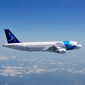
PRODUCTION / REALIZATION TECHNOLOGY: Color: The Atlantic Azures. Seen from space, the Atlantic has the shape of a large S which could be from SATA. And our new colors are the Atlantic azures of this huge "sea on our doorstep", which embraces a fifth of the Earth´s total surface. There are 3 colors in the new SATA symbol: Deep blue, Ocean blue and Sky blue (648/640/637 Pantones). The new "Atlantic azure" colors enables a new paint scheme for optimum impact and greater longevity. SPECIFICATIONS / TECHNICAL PROPERTIES: Design onto Aircrafts: Airbus A310, A320; Bombardier Q400, Q200; Website; uniforms; merchandising; brochures; flyers; campaings; labels; signs; sales office and corporate communication. TAGS: SATA Airlines, Atlantic, Azores, Airbus, Bombardier, Aircraft, Symbol, Fly, Brand RESEARCH ABSTRACT: SATA has in its identifying roots the depth of the Azorean soul, having assumed the commitment to combat the archipelago’s isolation. The colors and symbols that accompany SATA’s image resemble to the colors of the Azorean sky and sea. Its symbol, composed by nine parts, symbolizes the union of the nine islands of the Portuguese archipelago. CHALLENGE: SATA was born from the Atlantic dream of a man and his love for the islands. It was founded in 1941 with the goal of creating an airline connection among the islands of the Azores and between the Azores and mainland Portugal. Its first flight, that of the Açor, was made in 1947. SATA´s identity is deeply rooted in the Azorean soul. It is committed to fighting against the isolation of the archipelago. SATA brings the world to the Azores and takes the Azores to the world. In its over 67 years of existence, it has established itself as a brand of the modern-day Azorean economy and identity. The result of a successful trajectory, SATA now flies to 50 destinations in addition to the Azores: Portugal mainland, Madeira, Europe, the African Coast, and North America. Along its pathway of national and international affirmation that is much greater than its initial aims, a number of challenges and opportunities have appeared which advocate a change in the SATA brand. ADDED DATE: 2014-03-12 09:23:01 TEAM MEMBERS (1) : ivity for SATA Airlines IMAGE CREDITS: P. Masclet/Airbus ATA/Azores Tourism ivity |
||||
| Visit the following page to learn more: https://www.sata.pt/en | |||||
| AWARD DETAILS | |
 |
Sata Airlines | Bia-Blue Islands açor Brand Identity by Sata Airlines Brand-Design by Ivity is Winner in Graphics, Illustration and Visual Communication Design Category, 2013 - 2014.· Press Members: Login or Register to request an exclusive interview with SATA Airlines Brand - Design by Ivity. · Click here to register inorder to view the profile and other works by SATA Airlines Brand - Design by Ivity. |
| SOCIAL |
| + Add to Likes / Favorites | Send to My Email | Comment | Testimonials | View Press-Release | Press Kit | Translations |


