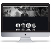
Finch & Partners Website by CHC Digital |
Home > Winners > #33240 |
 |
|
||||
| DESIGN DETAILS | |||||
| DESIGN NAME: Finch & Partners PRIMARY FUNCTION: Website INSPIRATION: As a company built for the modern media age, Finch & Partners is at the forefront of branded content creation. We drew our inspiration from 1960’s ad agencies, the movie business and luxury industries to coincide with their business offering. With this in mind, our aim was to discreetly display the Finch & Partners content in an innovative manor, all whilst ensuring visitors can quickly grasp the intricate business practice at hand. UNIQUE PROPERTIES / PROJECT DESCRIPTION: We took the approach of displaying the entire web content on a single page, allowing user interaction to be swift whilst providing a journey of discovery using hidden expandable content areas, all whilst maintaining a fluid layout. This includes the introduction of way points for easy navigation and parallax scrolling with a fluid layout. OPERATION / FLOW / INTERACTION: Given the visually provocative content layout available, we developed a unique concept that entices the visitor to discover details on past and present work. All without the need for multi layered navigation. By clicking brand logos and case studies buttons, visitors are shown a hidden side bar of content without being taken to a new page. PROJECT DURATION AND LOCATION: The client had very specific brief to ensure they did not breach their own client’s confidentiality, all whilst maintaining self promotion. Once the brief had been finalised, we designed the concept early November, and launched the site 6 weeks later. |
PRODUCTION / REALIZATION TECHNOLOGY: For the majority of the design, we combined Photoshop mock-ups with a 960 grid system to setup the over arcing look and feel, including UX and UI. We then used CSS3 to create the circles, hover states, drop shadows, textures, gradients and menu bar opacity. Given the high end and luxury nature of the business, we looked at the aesthetics from the perspective of a 60’s ad agency. We used multilayered JavaScript to create all of the animation on the site. This includes the hidden content pop out for case studies/talent and the navigation waypoints. SPECIFICATIONS / TECHNICAL PROPERTIES: Fluid 960s grid layout with Parallax scrolling and way points. Custom Google Fonts and Map implemented. TAGS: One Page, Fluid Layout, Parallax, Way Points, Hidden Content RESEARCH ABSTRACT: As a company built for the modern media age, Finch & Partners is at the forefront of branded content creation. We drew our inspiration from 1960’s ad agencies, the movie business and luxury industries to coincide with their business offering. With this in mind, our aim was to discreetly display the Finch & Partners content in an innovative manor, all whilst ensuring visitors can quickly grasp the intricate business practice at hand. CHALLENGE: The main obstacle was to capture the essence of the company strap line statement, whilst maintaining an old school feel with modern capabilities and technology. F&P strap line: International Creative Brand Consultancy Bridging The Gap Between The World's Leading Multinational Brands And Creative Industries ADDED DATE: 2014-02-26 07:46:59 TEAM MEMBERS (2) : Harrison Williams and Michael Porter IMAGE CREDITS: CHC Digital, 2013. |
||||
| Visit the following page to learn more: http://finchandpartners.com/ | |||||
| AWARD DETAILS | |
 |
Finch & Partners Website by Chc Digital is Winner in Website and Web Design Category, 2013 - 2014.· Read the interview with designer CHC Digital for design Finch & Partners here.· Press Members: Login or Register to request an exclusive interview with CHC Digital. · Click here to register inorder to view the profile and other works by CHC Digital. |
| SOCIAL |
| + Add to Likes / Favorites | Send to My Email | Comment | Testimonials | View Press-Release | Press Kit |
Did you like Chc Digital's Web Design?
You will most likely enjoy other award winning web design as well.
Click here to view more Award Winning Web Design.


