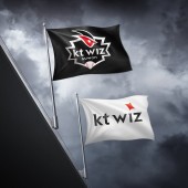
kt wiz baseball team Brand Identity by kt Corporation |
Home > Winners > #32792 |
 |
|
||||
| DESIGN DETAILS | |||||
| DESIGN NAME: kt wiz baseball team PRIMARY FUNCTION: Brand Identity INSPIRATION: 'kt wiz' stands for 'wizard' and at the same time it includes the meaning of 'power of superb abilities and control.' We visualized kt wiz's commitment of playing games like magic with superb skills and excellent performance. The key design concept 'burst of magic' is inspired by the burst lighting of magical moments. To build a strong visual identity system, the concept continues throughout the details of kt wiz BI including outline of Initial Symbol, shape of the eye in Image Symbol, Outline of signage panel and on the headlights of the bus. Devoted to make distinctions in typical and monotonous designs of all 9 baseball teams in Korea, kt wiz opens a new arena for sports brand with innovative and far more sophisticated BI design. UNIQUE PROPERTIES / PROJECT DESCRIPTION: The audience is encouraged to engage with various design application which performs at both online and offline. With a wide range of BI application, it is our goal to increase sales as well as earn loyalty from citizens of Suwon, the hometown of kt wiz. OPERATION / FLOW / INTERACTION: The audience is encouraged to engage with various design application which performs at both online and offline. With a wide range of BI application, it is our goal to increase sales as well as earn loyalty from citizens of Suwon, the hometown of kt wiz. PROJECT DURATION AND LOCATION: - Project period : January ~ November, 2013 - Release date : November 14, 2013 BI Launching (Press conference) - Designed developed by : Staff in U.S. and Korea FITS BEST INTO CATEGORY: Graphics, Illustration and Visual Communication Design |
PRODUCTION / REALIZATION TECHNOLOGY: - 2D Software : Adobe Creative Suite, Indesign - 3D Software : 3DS Max, Maya, Rhino - Movie Software : Adobe Premiere, Adobe After Effect SPECIFICATIONS / TECHNICAL PROPERTIES: - TAGS: kt wiz, baseball, Brand Identity, BI, sports, sports branding, South Korea, Image Symbol, Initial Symbol, emblem, logo, symbol RESEARCH ABSTRACT: - At the early stage, 'Design Preference Survey' was conducted with 530 baseball fans. As a result, using two character (41%) was preferred than using one character (31%) for the initial symbol. Reflecting the insights, the Initial Symbol of kt wiz was designed as two characters. - An extensive study on 125 sports branding case (MLB, NFL, NPB) as well as market research on 113 sports branded products set direction for product development process. - Sports branding case study were conducted with sports management experts to demonstrate the power of successful design. Resultantly, we came up with a design solution that can earn fan's loyalty from various profile and increase awareness of the brand. CHALLENGE: Seek active support from home fans and distinction for between other sports brands. The emblem design reflects Suwon city, to show it is a community-oriented team. Most existing emblems tend not to show the name of their base region. Yet, after series of design development focused on proportion, size and color, kt wiz emblem states the name of the hometown Suwon in a clear and harmonious manner. As a design concept, the emblem design expresses the outer line of Banghwasuryujeong Watchtower of Suwon Castle, the landmark of the city. The emblem with a Korean traditional curve is widely loved by citizens of Suwon and fans right after launching. ADDED DATE: 2014-02-20 00:11:48 TEAM MEMBERS (4) : - Creative Director : Leehwan Kang, - Lead Designer : Jaehee Lim, - Designers : Kyoungjin Lee, Bumsuk Kim, Yonu Cho and - Design Partner : Verlander Design IMAGE CREDITS: Creator kt corp./kt wiz BI, 2013 |
||||
| Visit the following page to learn more: http://www.ktwiz.co.kr | |||||
| AWARD DETAILS | |
 |
Kt Wiz Baseball Team Brand Identity by Kt Corporation is Winner in Graphics, Illustration and Visual Communication Design Category, 2013 - 2014.· Press Members: Login or Register to request an exclusive interview with kt Corporation. · Click here to register inorder to view the profile and other works by kt Corporation. |
| SOCIAL |
| + Add to Likes / Favorites | Send to My Email | Comment | Testimonials | View Press-Release | Press Kit |


