kt wiz Mascot (vic & ddory) Brand Identity by Yonu Cho |
Home > |
 |
|
||||
| DESIGN DETAILS | |||||
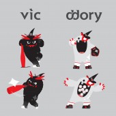
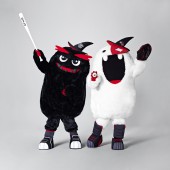
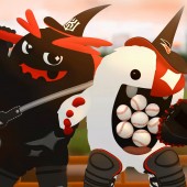
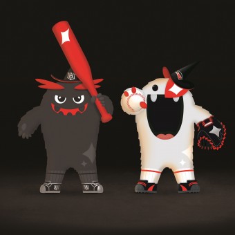
| DESIGN NAME: kt wiz Mascot (vic & ddory) PRIMARY FUNCTION: Brand Identity INSPIRATION: In this project, the western 'wizard' is redefined as 'Dokkebi', a traditional magical creature in Korea. We were inspired by the graphical patterns of Dokkebi at Hwaseong fortress, a landmark of the Suwon City. Ordinary form of Dokkebi may look a little scary but it still gives silly fun impression. Unlike horrifying monsters, Dokkebi can be mischievous but once they become your friends, they help you with miraculous power and make your wish come true. Reflecting their nature, characteristic and background, the story of vic and ddory was made. UNIQUE PROPERTIES / PROJECT DESCRIPTION: < vic & ddory are the mascot of kt wiz, the 10th professional baseball team of Korea Telecom launched in Korea, winter 2013. > Together, they are pronounced as 'victory' to mean the success of kt wiz. Inspired by the concept of 'Magic' generated from the team's name, cute monsters with magical power were born. Targeting at the growing population of female and children baseball fans, the monsters are made of furry fabric to give an attractive yet comfortable feel. They also have their own birth story: Two little monsters living in the Suwon home stadium happen to get magical symbol and become 'vic' and 'ddory', to lead the fans to cheer for kt wiz. We utilized kt wiz brand identity by using the main brand colors black, white, and red. Merchandize products with the mascot such as cushion, bag, cap and doll are also widely loved after being released. OPERATION / FLOW / INTERACTION: kt wiz mascot vic and ddory open new possibility to go beyond the scope of a typical baseball brand as well as to enter the area of entertainment. Also it targets towards a broader audience; women and children. Consistent brand identity is indicated on vic and ddory's detail which establishes a strong collective feel. vic and ddory perform and lead cheering fans at games in their mascot costumes. To build intimacy, they sometimes interact with the fans outside of stadium such as at the shopping mall, workplaces and subway. PROJECT DURATION AND LOCATION: - Project period : January ~ November, 2013 - Release date : November 14, 2013 BI Launching (Press conference) - Designed developed by : Staff in U.S. and Korea FITS BEST INTO CATEGORY: Graphics, Illustration and Visual Communication Design |
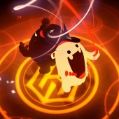
PRODUCTION / REALIZATION TECHNOLOGY: - 2D Software : Adobe Creative Suite, Indesign - 3D Software : 3DS Max, Maya, Rhino - Movie Software : Adobe Premiere, Adobe After Effect - Modeling : Prototyping, Foam modeling - Material : Plush, Synthetic fiber batting, Polyester Fiber, Latex, Eye mesh, Shoe Covers, Foam SPECIFICATIONS / TECHNICAL PROPERTIES: - TAGS: kt wiz, baseball, Brand Identity, BI, sports, sports branding, South Korea, vic, ddory, mascot design, mascot, character RESEARCH ABSTRACT: At the early stage, 'Design Preference Survey' was conducted with 530 baseball fans and based on their feedbacks we objectified our design direction. By completing research and analysis on 130 domestic and international mascots we discovered three key factors for successful mascot development: First, the design should be appealing to children and women since they are making a majority of purchase. Second, use soft fabric and third, create an interesting background story and make the character alive! At design stage, we showed sample products to 25 children from age 4 to 13 and received feedback. They preferred cute looking appearance along with soft furry fabric. Majority said furry fabric makes them want to cuddle and it feels very similar to the mascot costume. Referring to the insights, the final design concept was selected. Entertaining personalities are commonly found in popular mascots of all time. We gave vic & ddory a special personality and an interesting background story. Also we created an animation video to help audience's understanding which made the story complete. CHALLENGE: Mascot costume design requires attention to details and numerous considerations on movability as they perform in the stadium environment. During the model making stage, we tried proportion of 1:3 and 1:4 (head: body) just like a common animation character. But the head portion was too big to move actively during the performance in the stadium. We tried 1 to 7 or maybe 8 and it looked less friendly. After completing wide range of testing with the costume prototype, kt wiz mascot design was completed with cuteness and agility. To share it with the public, we even produced video clips of vic and ddory in real life riding a motorcycle, performing in dance battle and commuting on subway to further promote. ADDED DATE: 2014-02-18 21:44:32 TEAM MEMBERS (4) : - Creative Director : Leehwan Kang, - Lead Designer : Jaehee Lim, - Designers : Sooyeon Kang, Yunseung Oh and - Design Partner : Locus IMAGE CREDITS: Photogrpher Junghwan Yoo, kt wiz mascot, 2013 |
||||
| Visit the following page to learn more: http://ktwiz.co.kr/web/wizbi/mascot.do | |||||
| AWARD DETAILS | |
 |
Kt Wiz Mascot (vic & Ddory) Brand Identity by Yonu Cho is Runner-up for A' Design Award in Graphics, Illustration and Visual Communication Design Category, 2013 - 2014.· Read the interview with designer Yonu Cho for design kt wiz Mascot (vic & ddory) here.· Press Members: Login or Register to request an exclusive interview with Yonu Cho. · Click here to register inorder to view the profile and other works by Yonu Cho. |
| SOCIAL |
| + Add to Likes / Favorites | Send to My Email | Comment | Testimonials |


