Massaya Packaging by BRANDiT. |
Home > Winners > #32564 |
 |
|
||||
| DESIGN DETAILS | |||||
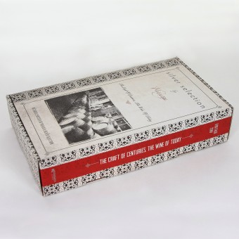
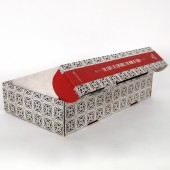
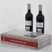
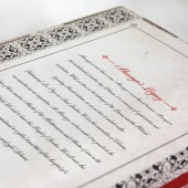
| DESIGN NAME: Massaya PRIMARY FUNCTION: Packaging INSPIRATION: Every wine bottle is a story. So we chose to make a functional and reusable package that looks like a vintage book. Books tell stories, and there’s a common feeling of heritage when you approach fine books and fine wine. UNIQUE PROPERTIES / PROJECT DESCRIPTION: Massaya is a decorative package to hold two wine bottles. Usually wine packages are made for vertical display and then the package is thrown away once the bottles are removed. We wanted to break this trend by finding a reusable solution that is true to the object it holds. We designed a horizontal package, since wine is best stored in this position, and made it to look like a vintage book so that buyers can reuse it as a decorative box. OPERATION / FLOW / INTERACTION: The design of this package allows the end user to reuse the package by replacing wine bottles, since wine bottles should be laid horizontally or simply take out the inner mould and use it as decorative box in a display shelf. This character makes it a more environmental friendly. PROJECT DURATION AND LOCATION: Winter 2013 FITS BEST INTO CATEGORY: Packaging Design |
PRODUCTION / REALIZATION TECHNOLOGY: After an extensive research we had few ideas in order to make the package design meet the clients requirement; reusable package, a collector's item... A unique idea that will stand out. A vintage book design. SPECIFICATIONS / TECHNICAL PROPERTIES: The package size is 39x22x8cm. The inner part has a special die cut with the shape of the 2 bottles to be safely laid in. To avoid using stickers, the closing system was designed with 2 side flaps and another 2 small flaps to seal the box perfectly. TAGS: WINE, PACKAGE, BOOK, REUSABLE, CONCEPTUAL RESEARCH ABSTRACT: We performed extensive research in packaging design with the objective of finding a unique idea for wine packaging, having in mind the main criteria, a reusable wine package. After the idea of the book was approved, we started the production experiments, to achieve a cost effective and functional package. Using a corrugate paper was the best way to withhold the weight of the bottles. the result was successful, the almost sold out all the quantity that they produced during the Christmas season. CHALLENGE: The biggest challenge was to transform the concept into a functional design. ADDED DATE: 2014-02-17 08:45:12 TEAM MEMBERS (2) : Creative Director Vicken Demirdjian and Designer Andrea Terzian IMAGE CREDITS: Vicken Demirdjian |
||||
| Visit the following page to learn more: http://www.brandit.co/massaya.html | |||||
| AWARD DETAILS | |
 |
Massaya Packaging by Brandit is Winner in Packaging Design Category, 2013 - 2014.· Press Members: Login or Register to request an exclusive interview with BRANDiT.. · Click here to register inorder to view the profile and other works by BRANDiT.. |
| SOCIAL |
| + Add to Likes / Favorites | Send to My Email | Comment | Testimonials | View Press-Release | Press Kit |
| COMMENTS | ||||||||||||
|
||||||||||||


