Circle Plaza Office Space by Regina Kwok |
Home > Winners > #32475 |
 |
|
||||
| DESIGN DETAILS | |||||
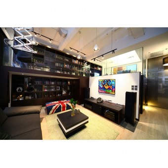
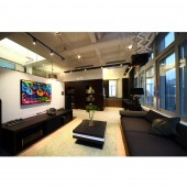
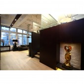
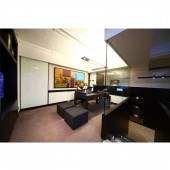
| DESIGN NAME: Circle Plaza PRIMARY FUNCTION: Office Space INSPIRATION: Scarcity of space in Hong Kong, the drive to work hard and play hard, and the ever longer working hours and faster pace in life – this was the demanding set of constraints becoming the norm today that led us to take inspirations from US tech company campuses. We learned from their approach in integrating work and play, and juxtaposed it onto the space constraint of Hong Kong. UNIQUE PROPERTIES / PROJECT DESCRIPTION: Although the space needed to serve dual purposes, letting elements of work and play interact too freely with each other would have risked a design that satisfied neither. So we broke away from the standard office solution of an open plan with movable partitions or even a standard home solution of having separate rooms for each purpose. Instead, we leveraged the unit’s 14-foot-high ceiling to create an elevated box for the office. Within this box, the occupant could concentrate well on his work. But it also had a large window that looked over the rest of the unit and out onto the street to ensure he would not feel cramped. Putting in the box also solved for another part of the brief: the space underneath was perfect for displaying and storing the owner’s art collection. The lack of natural light ensured that objects would not be damaged, and allowed for track lightings to be positioned flexibly to facilitate visitors in appreciating the collection. Setting the box in one corner, we used another corner of the unit to create a small kitchenette and extra working space. We put in a long bench to give flexibility to the company on the number of additional staff they could bring in. Turning to the unit’s centre, we created the company meeting room here by installing the projector and screen for presentations. In addition, the full sofa set and coffee table placed here served to visually anchor the whole office. But staying consistent with our concept of integrating work and play, this setup was also perfect as a home theatre for the owner’s family when they would come on the weekends. OPERATION / FLOW / INTERACTION: - PROJECT DURATION AND LOCATION: Causeway Bay, Hong Kong FITS BEST INTO CATEGORY: Interior Space and Exhibition Design |
PRODUCTION / REALIZATION TECHNOLOGY: - SPECIFICATIONS / TECHNICAL PROPERTIES: - TAGS: Office, Home office, work and play, Tech Campuses, Interior Design, Hong Kong RESEARCH ABSTRACT: - CHALLENGE: The client was the owner of a boutique financial services firm looking to create an office that would double as an extension of his home. He came with a list of disparate list of requirements in the brief: working space for one, but sometimes up to five people; display and storage space for his art collection; and space to relax in when he would come here on the weekends, usually after working out at a nearby sports club. To deliver a mixed-use project within a space of 1,500 square feet, we had to develop a “think within the box” solution. ADDED DATE: 2014-02-14 03:36:35 TEAM MEMBERS (1) : Regina Kwok IMAGE CREDITS: Regina Kwok, 2013. |
||||
| Visit the following page to learn more: http://www.artwill.com.hk/projects/circl |
|||||
| AWARD DETAILS | |
 |
Circle Plaza Office Space by Regina Kwok is Winner in Interior Space and Exhibition Design Category, 2013 - 2014.· Read the interview with designer Regina Kwok for design Circle Plaza here.· Press Members: Login or Register to request an exclusive interview with Regina Kwok. · Click here to register inorder to view the profile and other works by Regina Kwok. |
| SOCIAL |
| + Add to Likes / Favorites | Send to My Email | Comment | Testimonials | View Press-Release | Press Kit |
Did you like Regina Kwok's Interior Design?
You will most likely enjoy other award winning interior design as well.
Click here to view more Award Winning Interior Design.


