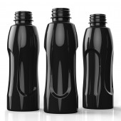
DESIGN NAME: Hoist
PRIMARY FUNCTION: Bottle
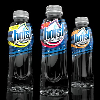
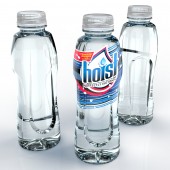
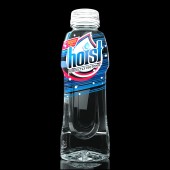
INSPIRATION: As the product is targeted toward active, athletic consumers, we wanted to explore silhouettes that communicated fitness, and were lean and svelte in form. We worked up a suite of designs that were gender-neutral, and conveyed movement and energy. Most importantly, we discreetly designed-in panels that - should the brand ever move from ambient-filling to hot-filling - could help to absorb the vacuum incurred by this thermal process.
UNIQUE PROPERTIES / PROJECT DESCRIPTION: Hoist is a 'true' isotonic that offers rapid rehydration. They pride themselves on this distinction, as the competitive set is actually comprised of hyper- or hypo- tonics, which are less effective rehydration solutions. They were in a short, stout package that was not intended for beverage at all, and was rigged to accommodate the product. The brand picked up steam in the medical community, but wasn't competing terribly well, even locally, in the consumer space. Wanting to be a stronger contender (with growth potential) on the sports drink shelf, they engaged us in a redesign. We completely redesigned the primary package (bottle), recommended moving up to 16oz, revisited their branding, and even changed the tagline.
OPERATION / FLOW / INTERACTION: No major concerns or need for technology built into the package as the product is ambient-filled, and does not deform the vessel. However, foreseeing the eventual need to move filling to a hot-fill platform, we designed discreet panels to help accommodate vacuum through controlled deformation.
PROJECT DURATION AND LOCATION: The project started in April 2013 in Cincinnati, Ohio and finished in June 2013 in Ann Arbor, Michigan, and was exhibited in Santa Monica, California at the BevNET Live conference in December 2013.
FITS BEST INTO CATEGORY: Packaging Design
|
PRODUCTION / REALIZATION TECHNOLOGY: Injection STretch Blow Molding (ISBM) process, using PET.
SPECIFICATIONS / TECHNICAL PROPERTIES: Diameter 67mm x Height 191mm
TAGS: hoist,scor creative,isotonic,svelte,bottle design,amcor,plastic bottle,slick
RESEARCH ABSTRACT: Used competitive set analysis to determine existing form language, and to identify 'archetypal voids' in the category. Devised strategy that would explore organic forms based loosely on human physiology, particularly the muscular system when strained or active. This gave way to a suite of designs that explored tension. Conducted a focus group for qualitative testing of initial concepts. Moved the selection in front of the customer, and which point the final design was chosen immediately.
CHALLENGE: Explore forms that convey movement, strain and fitness, and are gender-neutral (or in this case, male-neutral and female-positive, as the brand already had a large male consumer base). To make the package cost-effective and quick to implement, design should be compatible with existing preforms, and compliant with typical copacker lines and equipment.
ADDED DATE: 2014-02-05 10:53:41
TEAM MEMBERS (3) : Moyal, Rangler and Harris
IMAGE CREDITS: Image #1 : Damien Moyal (Senior Design Lead), 2013
Image #2 : Damien Moyal (Senior Design Lead), 2013
Image #3 : Damien Moyal (Senior Design Lead), 2014
Image #4 : Damien Moyal (Senior Design Lead), 2014
Image #5 : Damien Moyal (Senior Design Lead), 2013
|