Komarija Oil Olive Oil Label by Matej Caric |
Home > Winners > #32115 |
 |
|
||||
| DESIGN DETAILS | |||||
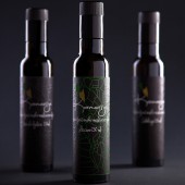
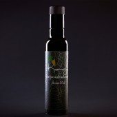
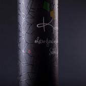
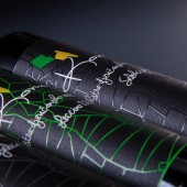
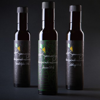
| DESIGN NAME: Komarija Oil PRIMARY FUNCTION: Olive Oil Label INSPIRATION: Main inspiration came while thinking of the connection in between the product and the message that product will send. For me, a clear source of inspiration was our home region of Istria , Croatia. A region rife with agricultural land that is so well organized, one can clearly see the parcel edges from above, divided by trees and dry-walls. UNIQUE PROPERTIES / PROJECT DESCRIPTION: "It's important to make something fresh and different from all the oil labels we have seen until now." were the words of my two clients. Their land is their life and passion so why not represent the whole area of a region and design a logo for their company based on the fields in which they grow their olive trees. Adding a three-dimensional relief texture on the lines to become a pleasure to touch and to have more of a visual impact.Old remained churches are marked on the label with a red cross. OPERATION / FLOW / INTERACTION: just by adding a three-dimensional lines texture on we managed the bottle to become a pleasure to touch and to have more of a visual impact. It's is very handy when it comes to selling, because of it's unique design, and grip it helps the purblind people to recognize just by touching it. PROJECT DURATION AND LOCATION: The project started in July of 2013 in Pazin, Istria and it took a great period on analyse and research. It got finalized and produced in December 2013 also in Pazin, Istria. FITS BEST INTO CATEGORY: Packaging Design |
PRODUCTION / REALIZATION TECHNOLOGY: through out the whole process of designing the label and production of the same we took the biggest care for ecological aspects. With this thing on mind we chose the paper which is mainly done out of ECO -recycle paper. Colors and wax which was used to indicate three-dimension textures consists all ECO sustainable certificates. SPECIFICATIONS / TECHNICAL PROPERTIES: all three labels are L 160 mm x W 132 mm TAGS: plots, istria, parcels, komarija, olive oil design, label design, land marks, matej caric, modern graphic design RESEARCH ABSTRACT: soon after passing the first phase of brain storming and realizing the design path I wanted to continue. First part what a research of olive oil sorts. their qualities, colors, regional aspects of grow, shape of leafs and fruit. Second phase was research of fonts of interest. third phase was technical part where I started to experiment with computer programs in the way to find the exact form of design. CHALLENGE: I wouldn't refer to "the hardest and most challenging" part of development. it's a field with endless possibilities, it's just up to a person/designer how deep they want to dig to creating/find/invent something different. ADDED DATE: 2014-01-28 05:54:00 TEAM MEMBERS (1) : Matej Caric IMAGE CREDITS: Photography by Sonda Studio |
||||
| Visit the following page to learn more: http://bit.ly/1fzqH4L | |||||
| AWARD DETAILS | |
 |
Komarija Oil Olive Oil Label by Matej Caric is Winner in Packaging Design Category, 2013 - 2014.· Read the interview with designer Matej Caric for design Komarija Oil here.· Press Members: Login or Register to request an exclusive interview with Matej Caric. · Click here to register inorder to view the profile and other works by Matej Caric. |
| SOCIAL |
| + Add to Likes / Favorites | Send to My Email | Comment | Testimonials | View Press-Release | Press Kit |
Did you like Matej Caric's Packaging Design?
You will most likely enjoy other award winning packaging design as well.
Click here to view more Award Winning Packaging Design.


