Cine Times Cinema by Ajax Law & Virginia Lung |
Home > Winners > #32066 |
 |
|
||||
| DESIGN DETAILS | |||||
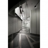
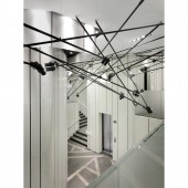
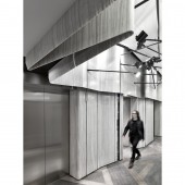
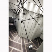
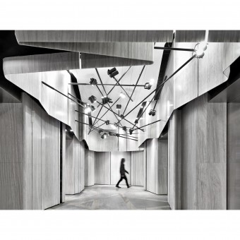
| DESIGN NAME: Cine Times PRIMARY FUNCTION: Cinema INSPIRATION: The 21st century opens a gateway to the new era of modern technologies and innovations. With the widespread of 3D and even 4D high definition movies available on global market, the old method of filming has gone scarce, if not extinct. When thinking of the theme for this cinema, the designers want to trace back to the roots when filmmaking began. Back in the 19th century, photographers captured continual images and stored them on a single compact reel of film. This ancient object – roll films, was being symbolized all over the cinema, reminding the audience the long forgotten history behind the scene. UNIQUE PROPERTIES / PROJECT DESCRIPTION: LCD movie screens playing the latest trailers greet the audience in the entrance, giving them news on the hottest movie trends. The edge of the table of the ticketing office bends smoothly along the ambient. The bending angles match those ‘roll films’ on the wall miraculously, which brings an extra dramatic vibe to the whole design. Above head hangs special-designed LED spotlights of eight various lengths in black, ranging from 1-6maiming at different directions. Light and shadows fulfil every corner; one might have mistaken it as the shooting spot of the newest film. Audience might fall into the illusion of fantasizing s/he is the lead actor/actress in a romantic comedy. Down on the ground, the floor resolve to the original state of roll films, black being the principal color. Grey stripes cut the black space into different geometric shapes and sizes, contrary to the rectangles on the wall, giving the design a frolicsome note. Inside the auditorium, spotlights of different lengths are directing all over the perimeter. They intersect along the wall, which creates an additional multidimensional atmosphere, hoping to provide the movie goers a warm and comfy viewing environment. OPERATION / FLOW / INTERACTION: Splattered with black and white, designers use white as the main frame of the roll films, which is opposite to the usual black color. The white background engulf the entire space, motioning itself smoothly along the wall of the building. Its flexibility reflects the nature of roll films. Thin pieces of black stripes intercut the white surface, resembling the breaking and reunifying of roll films, forming rectangles of different sizes and shapes. PROJECT DURATION AND LOCATION: The project finished in November 2013 in Hong Kong. FITS BEST INTO CATEGORY: Interior Space and Exhibition Design |
PRODUCTION / REALIZATION TECHNOLOGY: Acoustic Panel/ Wallpaper/ Carpet/ Fabric/ Glass/ Steel/ Stone/ Wood SPECIFICATIONS / TECHNICAL PROPERTIES: 1900sqm TAGS: Cine Times, cinema RESEARCH ABSTRACT: With the technology advancement, electronic appliances come with more complicated functions and utilities, yet their looks grow towards simplicity to facilitate easier human usage, like the touch screens of mobile phones and plasma TVs. Using two simple color components – black and white, the design of the cinema elaborates on the ‘minimalist’ style. Above head hangs special-designed LED spotlights of eight various lengths in black, light and shadows fulfil every corner. Like the simplicity exterior of modern technology, the cinema design simplifies complicated details, which puts user-friendly interfaces in its priority. CHALLENGE: - ADDED DATE: 2014-01-26 23:57:38 TEAM MEMBERS (2) : Ajax Law and Virginia Lung IMAGE CREDITS: Ajax Law Jonathan Leijonhufvud |
||||
| Visit the following page to learn more: http://www.onepluspartnership.com/ | |||||
| AWARD DETAILS | |
 |
Cine Times Cinema by Ajax Law & Virginia Lung is Winner in Interior Space and Exhibition Design Category, 2013 - 2014.· Press Members: Login or Register to request an exclusive interview with Ajax Law & Virginia Lung. · Click here to register inorder to view the profile and other works by Ajax Law & Virginia Lung. |
| SOCIAL |
| + Add to Likes / Favorites | Send to My Email | Comment | Testimonials | View Press-Release | Press Kit |

