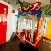
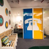
GOOGLE Corporate Offices by Juan Carlos Baumgartner |
Home > Winners > #31853 |
| CLIENT/STUDIO/BRAND DETAILS | |
 |
NAME: PROFILE: Google is an American multinational corporation specializing in Internet-related services and products. These include search, cloud computing, software, and online advertising technologies. Its mission statement from the outset was "to organize the world's information and make it universally accessible and useful". It offers online productivity software including email (Gmail), an office suite (Google Drive), and social networking (Google+). Desktop products include applications for web browsing, organizing and editing photos, and instant messaging. Since the beginning, they’ve focused on providing the best user experience possible. The world is increasingly mobile: people want access to information wherever they are, whenever they need it. They’re pioneering new technologies and offering new solutions for mobile services that help people all over the globe to do any number of tasks on their phone, from checking email and calendar events to watching videos, not to mention the several different ways to access Google search on a phone. Their founders built Google around the idea that work should be challenging, and the challenge should be fun. They believe that great, creative things are more likely to happen with the right company culture–and that doesn’t just mean lava lamps and rubber balls. There is an emphasis on team achievements and pride in individual accomplishments that contribute to their overall success. They put great stock in our employees–energetic, passionate people from diverse backgrounds with creative approaches to work, play and live. Their atmosphere may be casual, but as new ideas emerge in a café line, at a team meeting or at the gym, they are traded, tested and put into practice with dizzying speed–and they may be the launch pad for a new project destined for worldwide use. |
| AWARD DETAILS | |
 |
Google Corporate Offices by Juan Carlos Baumgartner is Winner in Sustainable Products, Projects and Green Design Category, 2013 - 2014.· Read the interview with designer Juan Carlos Baumgartner for design GOOGLE here.· Press Members: Login or Register to request an exclusive interview with Juan Carlos Baumgartner. · Click here to register inorder to view the profile and other works by Juan Carlos Baumgartner. |
| SOCIAL |
| + Add to Likes / Favorites | Send to My Email | Comment | Testimonials | View Press-Release | Press Kit |
Did you like Juan Carlos Baumgartner's Sustainable Product Design?
You will most likely enjoy other award winning sustainable product design as well.
Click here to view more Award Winning Sustainable Product Design.


