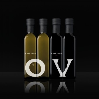
Bragazzis Olive Oil and Vinegar Typographic Excellence by PACKLAB |
Home > Winners > #31308 |
 |
|
||||
| DESIGN DETAILS | |||||
| DESIGN NAME: Bragazzis Olive Oil and Vinegar PRIMARY FUNCTION: Typographic Excellence INSPIRATION: The owner himself was a big inspiration half British and half Italian Matteo Bragazzi is full of life and passion for the food he sells. A big and bold is apart of their character and the brand, yet we felt it needed to reflect the rich history and respect it has earned over three generations. Something classical and respectful, yet some thing big bold and modern too. UNIQUE PROPERTIES / PROJECT DESCRIPTION: Bragazzis is a fine Italian food retailer in the North of England, that has been in the industry for three family generations. Despite of the long company history, Bragazzis as a brand was lacking an identity. In light of the retailerʼs ambitions to expand its market presence to the south of the UK, PACKLAB was asked to design a visual identity that could compete with other premium fine food retailers on-line. We incorporated direct product symbolism within a modern minimalistic design, that works jointly to deliver distinct shelf presence for the range of brand name products. The new identity boldly communicates the purity and premium quality of the products, while positioning Bragazzis as an upscale brand with maturity and vision. OPERATION / FLOW / INTERACTION: - PROJECT DURATION AND LOCATION: - FITS BEST INTO CATEGORY: Packaging Design |
PRODUCTION / REALIZATION TECHNOLOGY: - SPECIFICATIONS / TECHNICAL PROPERTIES: - TAGS: Brand Identity, Packaging Design, Olive Oil and Vinegar RESEARCH ABSTRACT: - CHALLENGE: - ADDED DATE: 2013-11-04 05:24:51 TEAM MEMBERS (1) : PACKLAB team IMAGE CREDITS: Juho Viironen |
||||
| Visit the following page to learn more: http://www.packdesign.com | |||||
| AWARD DETAILS | |
 |
Bragazzis Olive Oil and Vinegar Typographic Excellence by Packlab is Winner in Packaging Design Category, 2013 - 2014.· Press Members: Login or Register to request an exclusive interview with PACKLAB. · Click here to register inorder to view the profile and other works by PACKLAB. |
| SOCIAL |
| + Add to Likes / Favorites | Send to My Email | Comment | Testimonials | View Press-Release | Press Kit |


