Multimedia exhibition Lsx20 Exhibition design by Design studio H2E |
Home > Winners > #30597 |
 |
|
||||
| DESIGN DETAILS | |||||
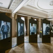
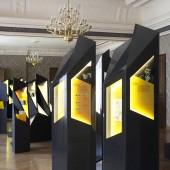
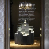
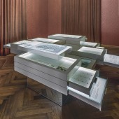
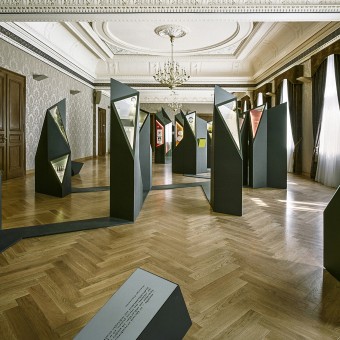
| DESIGN NAME: Multimedia exhibition Lsx20 PRIMARY FUNCTION: Exhibition design INSPIRATION: The purpose of the exhibition is to introduce the framework of the trinity on which the artistic project is based-banknotes and coins, the authors and their art works. The concept of the exhibition originates from graphite or lead that is the central axis of a pencil, a common tool for artists. Graphite structure serves as the main inspiration and central design exposition element of the exhibition, their layout in the room mirrors the crystalline hexagonal grid of carbon, with each facet featuring the creative ideas of artists. UNIQUE PROPERTIES / PROJECT DESCRIPTION: A multimedia exposition is devoted to the 20th anniversary of the reintroduction of the national currency lats, and its purpose is to show banknotes and coins, the authors and their creative work. The central axis of a pencil, a common tool for artists, is lead or graphite. Graphite structure is represented by the exhibition exposition elements. OPERATION / FLOW / INTERACTION: In the first hall of the exhibition the visitor experiences dynamic flow of the money that is projected on walls. At the central hall 4 realistic virtual artists speak among themselves encouraging visitors to revisit their views. Artists also interact with the visitors at the Creative hall where their virtual image tells visitors about the creative process and invites visitors to create their own coin design. PROJECT DURATION AND LOCATION: The project started in September 2012 and finished in May 2013. Exhibition was opened to public March - May 2013 in Riga, Latvia. FITS BEST INTO CATEGORY: Interior Space and Exhibition Design |
PRODUCTION / REALIZATION TECHNOLOGY: The form used to achieve the purpose is a multimedia exhibition where each halls creative assignment is solved through versatile use of latest multimedia technologies. Unitary audiovisual video projection, stream of different objects on three walls, immerses visitor in nervously shifting flow of circulation currency. Crystalshaped showcases display coins, their sketches and objects of artistic inspiration. Video interviews of almost present artists lead visitors into their views about the money. SPECIFICATIONS / TECHNICAL PROPERTIES: The total area of ehxibition was 360 m2, which included five different spaces, designed in historic building of The Bank of Latvia. Exhibition was made from several types of materials-MDF, aluminium composite panel Neobond, plastic, organic glass, glass, digital print, oracal. TAGS: Multimedia exhibition, Money as an artwork, National currency, Design of the money, Art Years of the national currency RESEARCH ABSTRACT: The main aspects of the research were money, the art and philosophy of its authors, space. Money is an artwork - we came up with the idea of a pencil. Afterwards we played with the idea of a pencil and came to its core element graphite. Structure upholds every idea so we researched on the structure of the graphite that happened to be crystalline. After this result of the study we created the main concept of the design. CHALLENGE: First considerable challenges emerged when the design process was at stage ideate, where several different scale and real-size 3-D model solutions were created. This process was capacious as we implemented it with hands. Second challenge was the realization. Due to the specific product-the symbolic crystalline structures of the graphite that were transformed into showcases with monitors-the whole process required serious research of the possible material solutions. ADDED DATE: 2013-09-27 10:34:15 TEAM MEMBERS (4) : Design studio H2E, Designers – Holgers Elers, Ingūna Elere, Graphic designers – Tatjana Raičiņeca, Ingūna Elere and Project team – Anete Šalma, Tatjana Raičiņeca, Līga Ansone, Krišjānis Vots, Dagnija Balode; Realization - H2E, Solavi, JURA PODNIEKA STUDIJA, MD Noass; Curator - Ramona Umblija; Client - The Bank of Latvia IMAGE CREDITS: Design studio H2E, 2013. |
||||
| Visit the following page to learn more: http://www.h2e.lv | |||||
| AWARD DETAILS | |
 |
Multimedia Exhibition Lsx20 Exhibition Design by Design Studio H2e is Winner in Interior Space and Exhibition Design Category, 2013 - 2014.· Press Members: Login or Register to request an exclusive interview with Design studio H2E. · Click here to register inorder to view the profile and other works by Design studio H2E. |
| SOCIAL |
| + Add to Likes / Favorites | Send to My Email | Comment | Testimonials | View Press-Release | Press Kit | Translations |

