Fresh St. Market Grocery by King Retail Solutions |
Home > Winners > #30593 |
 |
|
||||
| DESIGN DETAILS | |||||
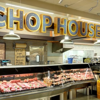
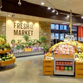
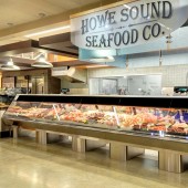
| DESIGN NAME: Fresh St. Market PRIMARY FUNCTION: Grocery INSPIRATION: KRS ultimately found inspiration in integrity, marrying the design to the retail intent of the space. For us, this meant an authentic “street market” or “waterfront market” persona. UNIQUE PROPERTIES / PROJECT DESCRIPTION: The client (H.Y. Louie, an independent food retailer in Canada) had a goal of highlighting the market position of “affordable fresh.” The project was to convert a building previously inhabited by Safeway into a completely new grocery destination in West Vancouver, BC. The overall brand and design concept was to exemplify a feeling of fun, wonder, and most importantly, a playground of fresh ingredients to combat the middle of the road grocery feeling of Fresh St. Market’s competitors. We provided full creative concept starting with brand identity, brand name, logo, positioning in marketplace, store planning of interior and exterior of store, lighting, fabrication, and supervision of installation. Thoughtful, visual displays dedicated to each “food destination” throughout the space became a major part of this design. Our firm designed the store to mirror an urban fresh feel, with destination areas employed as visual focal points. Each department acts as a boutique-within-stor OPERATION / FLOW / INTERACTION: - PROJECT DURATION AND LOCATION: This project was launched in August 2012 with store opening in January 2013 in West Vancouver, BC. FITS BEST INTO CATEGORY: Interior Space and Exhibition Design |
PRODUCTION / REALIZATION TECHNOLOGY: The design/planning team was given liberty to provide various custom fixtures with a focus on creating bright, unique ways to display fresh food. A great example is the Soup & Salad Bar Island. The vertical materials included corrugated steel and wood grain around the island, topped with a Caesarstone countertop. In fact, simple, rustic materials were used throughout Fresh St. Market to provide an authentic “street market” or “waterfront market” persona – this included exposed grain edges of wood and metallic features. SPECIFICATIONS / TECHNICAL PROPERTIES: - TAGS: local, organic, honest, sustainable, grocery, retail, urban, foodie, street market RESEARCH ABSTRACT: Our research journey began with understanding the retailer’s market position (in terms of quality and price) compared to its local competition, fleshing out the store’s goals & values, and then putting a persona, a face, to Fresh St. Market. We knew there was an over-arching emphasis on local producers, foods, and programs. In fact, the vision (which was achieved) is to load one side of the store, literally half of the space, with fresh fare – a collection of boutique-within-stor CHALLENGE: We had two unique challenges with this project. The first, that we weren’t able to site survey the store (a very old Safeway) prior to starting our design process, due to the prior tenant still occupying the space. We were interested in opening the ceiling to add several ceiling features and bring more light into the space, but couldn’t confirm that was possible. The second challenge was the expedited timeline - an unusually short (six month) time-frame start to finish, via client request. We overcame these challenges by working quickly and efficiently to create a beautiful, solid design with the assumption that the ceiling wasn’t available to change. We incorporated a lighting design concept that offered plenty of dramatic, ambient illumination and product placement lighting to provide the perfect amount of twinkle to showcase the plethora of fresh ingredients in the store. ADDED DATE: 2013-09-27 08:18:51 TEAM MEMBERS (1) : Christopher Studach, Marco Ingracio, Anna Victoria, Christina Bennett IMAGE CREDITS: All Images: Photographer Levi Groeneveld, 2013 |
||||
| Visit the following page to learn more: http://www.kingrs.com/portfolio/fresh-st |
|||||
| AWARD DETAILS | |
 |
Fresh St. Market Grocery by King Retail Solutions is Winner in Interior Space and Exhibition Design Category, 2013 - 2014.· Read the interview with designer King Retail Solutions for design Fresh St. Market here.· Press Members: Login or Register to request an exclusive interview with King Retail Solutions. · Click here to register inorder to view the profile and other works by King Retail Solutions. |
| SOCIAL |
| + Add to Likes / Favorites | Send to My Email | Comment | Testimonials | View Press-Release | Press Kit |
Did you like King Retail Solutions' Interior Design?
You will most likely enjoy other award winning interior design as well.
Click here to view more Award Winning Interior Design.


