Nanchang Insun International Cinema Cinema by Ajax Law & Virginia Lung |
Home > Winners > #30537 |
 |
|
||||
| DESIGN DETAILS | |||||
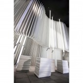
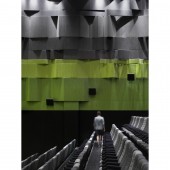
| DESIGN NAME: Nanchang Insun International Cinema PRIMARY FUNCTION: Cinema INSPIRATION: The cinema, located in a Book City, has inspired the designers to combine the two elements into their design. Books are normally being published with white background and black fonts, whereas films, acting the opposite way, having images printed on black frames instead. The cinema uses this special correlation between books and films, by mix and matching their respective colors - white and black. UNIQUE PROPERTIES / PROJECT DESCRIPTION: The cinema, located in a Book City, has inspired the designers to combine the two elements into their design. White background with black font is basically the most often used book printing format around the globe. When you come to think about it, the film’s nature is acting exactly opposite to the books. Cinematographers use black frames to capture the precious moment of different actions. Set aside the genuine difference of black and white background used between films and books, it’s an astonishing fact that how they actually correlate with each other. Both of them use a series of still images to depict meaningful stories. Through words and pictures, though indifference in medium, striving towards the same goal - to inspire and ignite the imagination of people who have locked their deepest desires inside. Black and white is the two main colour components of the Nanchang Insun International Cinema. When you enter the cinema, you’d encounter a sea of whiteness. Pages of the books are flipping along the wall. Be careful not to stare at the wall for so long, or you’d be dazzled by the sea of the books! Located in the middle of the lobby, there’re stacks of ‘paper’ standing on the floor. When looking from afar, you’d be mistaken and fallen into the illusion into thinking they’re real paper! Turned out they’re the cashier made up of corian. Passing through the lobby into the hallway, the background switched from white to a striking black. Blackness has engulfed the whole space, including the floor, the ceiling and the pillars. Words of different fonts and colours scattered randomly against the black surface, forming famous dialogues extracted from classical movies. Here comes the good example of the harmonious interchange between books and films again. The film dialogues, appearing in the form of words, remind us of the natural coexistence among them, being so different in nature, yet serving the same purpose of delivering encrypted messages. The corridor would lead you directly to the waiting room. Among the sea of the books appear in front of your eyes, you’d immediately notice two huge marble pillars. The natural pattern of the pillars looks surprisingly like the spine of the books. Narrow strips of green cylindrical spotlights are arranged in a crisscross manner hanging from the ceiling. The greenness adds an extra hint of Mother Nature aura to the perimeter. Books are made of paper, and paper originates from wood. The cylindrical spotlights look like branches stretching out from the trunk, fighting against each other for the warmth of the sun. The black doors look like black frames, yet it also resembles the image of black-dyed pages. Strips of light beams leak through the door gap, reflecting on the floor and the ceiling. The light beams interlock each other geometrically. When you think of film, you’d link it towards light and shadow. Suddenly, the light beams and shadow formed by the black doors also trigger your memory of book pages. They intertwine and fold into heaps of butterflies flying towards various directions. However, for the sake of the love of words, they have chosen to stay at last. The pattern of the carpet in the cinema looks like a gigantic bookshelf, the aura of the books still lingers the perimeter while the moviegoers are enjoying the movie at the same time. OPERATION / FLOW / INTERACTION: First, you’d see pages of the books flipping along the wall. There’re stacks of ‘paper’ standing on the floor. When looking from afar, you’d be mistaken and fallen into the illusion into thinking they’re real paper! Turned out they are the ticketing office made up of corian. Passing through the lobby into the hallway, the background switched from white to a striking black. Words of different fonts and colors scattered randomly against the black surface, forming famous dialogues extracted from classical movies. PROJECT DURATION AND LOCATION: The project finished in July 2013 in Nanchang, China. FITS BEST INTO CATEGORY: Interior Space and Exhibition Design |
PRODUCTION / REALIZATION TECHNOLOGY: Carpet/ Solid Surfacing/ Plastic Laminate SPECIFICATIONS / TECHNICAL PROPERTIES: 7285sqm TAGS: Nanchang, Cinema RESEARCH ABSTRACT: - CHALLENGE: Client Objectives and program: The cinema, located in a Book City, has become the client’s main concern. He wants to blend in the concept of books into the cinema design. So when the moviegoers enter the cinema, they would have the images of books all over their minds, interbreeding a mixture of films and books elements. How our design achieved the client objectives: Books are normally being published with white background and black fonts, whereas films, acting the opposite way, having images printed on black frames instead. The cinema uses this special correlation between books and films, by mix and matching their respective colors - white and black. First, you’d see pages of the books flipping along the wall. There’re stacks of ‘paper’ standing on the floor. When looking from afar, you’d be mistaken and fallen into the illusion into thinking they’re real paper! Turned out they are the ticketing office made up of corian. Passing through the lobby into the hallway, the background switched from white to a striking black. Words of different fonts and colors scattered randomly against the black surface, forming famous dialogues extracted from classical movies. ADDED DATE: 2013-09-26 23:37:12 TEAM MEMBERS (2) : Ajax Law and Virginia Lung IMAGE CREDITS: Ajax Law Jonathan Leijonhufvud |
||||
| Visit the following page to learn more: http://www.onepluspartnership.com/ | |||||
| AWARD DETAILS | |
 |
Nanchang Insun International Cinema Cinema by Ajax Law & Virginia Lung is Winner in Interior Space and Exhibition Design Category, 2013 - 2014.· Press Members: Login or Register to request an exclusive interview with Ajax Law & Virginia Lung. · Click here to register inorder to view the profile and other works by Ajax Law & Virginia Lung. |
| SOCIAL |
| + Add to Likes / Favorites | Send to My Email | Comment | Testimonials | View Press-Release | Press Kit |


