|
|
|

|
|
| DESIGN DETAILS |
DESIGN NAME:
Nugan Estate-Matriarch
PRIMARY FUNCTION:
Wine
INSPIRATION:
The design inspiration draws on the medieval art form of illuminated letters.
UNIQUE PROPERTIES / PROJECT DESCRIPTION:
BRIEF: To create a limited release, premium brand in honour of the former company CEO-the Matriarch.
SOLUTION: The brand mark and packaging livery needed to have an understated elegance and simplicity with an overarching strength.
OPERATION / FLOW / INTERACTION:
This product is targeted at a discerning consumer, so the packaging communicates
the premium nature of the brand in a simple and elegant way.
PROJECT DURATION AND LOCATION:
From concept through to production took 5 months. The brand was released in February 2013.
FITS BEST INTO CATEGORY:
Packaging Design
|
PRODUCTION / REALIZATION TECHNOLOGY:
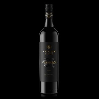
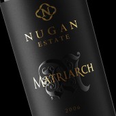
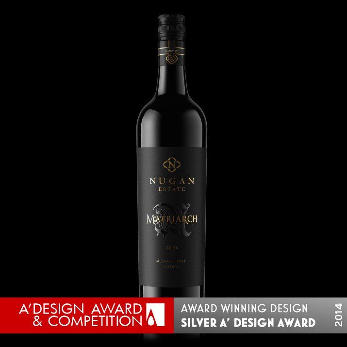
The brand mark is woven into the M symbol and elevated off the label through the combined finishes of embossing, high-build varnish and foiling. The remaining design elements are embossed and foiled, sitting on a sumptuous velvety black achieved by a double pass of black printed on an uncoated stock. The capsule label is a simple cross style band die-cut, embossed and foiled.
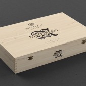
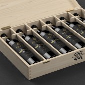
The product is presented in a raw wooden box with the brand mark simply screen printed on the lid and front panels.
SPECIFICATIONS / TECHNICAL PROPERTIES:
Both the front and back labels are tapered to seamlessly fit the bottle profile, maximising the natural elegance of its shape.
The front label is 100mm wide by 145mm high, the back label is 68mm wide by 135mm high. Applying such a large label with critical neck label alignment made this job quite challenging but the result was impeccable.
TAGS:
Premium wine, premium wine packaging, wine box, wine packaging, wine, beverage, luxury
RESEARCH ABSTRACT:
The client wanted this product to have a regal feel, to have confidence and yet be understated. To deliver this result, was like choosing a stunningly simple piece of jewelry worn against an unassuming black dress. The only way to achieve this was to employ a clever combination of print finishes, too much of anything would have tipped it over the edge. Balance is everything.
CHALLENGE:
For any design to look understated and yet elegant and refined is always a challenge. Space, balance and proportions have to work in complete harmony for
a label to create this sort of aesthetic.
ADDED DATE:
2013-09-09 21:10:45
TEAM MEMBERS (1) :
IMAGE CREDITS:
Angela Spindler-Depot, 2013.
|
| Visit the following page to learn more: http://www.wearedepot.com.au |
|
| CLIENT/STUDIO/BRAND DETAILS |
 |
NAME:
Depot Creative Pty Ltd
PROFILE:
We're packaging design experts that understand brands like no one else.
We work with businesses of all kinds, from well established companies to
innovative start ups.
We specialise in structural packaging design, packaging design graphics and
branding.
|
|
|
| COMMENTS |
| Giulia Esposito |
Comment #996 on December 24, 2022, 4:23 pm |
|
I am totally blown away by the superb design of the Nugan Estate-Matriarch packaging. It is truly a work of art! The attention to detail from the use of shapes and colors to the overall structure of the container is simply stunning. I feel that the designer has put a great amount of thought into this work and it really shines through. The end result is a wonderfully crafted package that is both visually appealing and highly functional. It is truly a masterpiece and I am proud to celebrate the success of the designer behind it. Congratulations to Angela Spindler-Depot for their award-winning design!
|
| Paul Phillips |
Comment #18989 on January 3, 2023, 5:57 am |
|
What a remarkable achievement! The Nugan Estate-Matriarch wine packaging design by Angela Spindler-Depot is truly stunning, with its understated elegance and strength. The branding and livery are a perfect fit for the limited release, premium brand, and the overall look and feel really capture the spirit of the former CEO. The attention to detail is remarkable, and the overall execution is flawless. This design is a testament to the talent and dedication of the designer, and an inspirational reminder of the power of design.
|
| Paul Williams |
Comment #19080 on January 3, 2023, 5:59 am |
|
I am so impressed by the Nugan Estate-Matriarch packaging design! It is a stunning work that is both understated and elegant. The clever combination of print finishes is perfectly balanced, creating a regal and confident feel that would be difficult to achieve. The medieval art form of illuminated letters used in the brand mark and packaging livery adds to the overall strength of the design. This is a prime example of good design, and a very deserving winner of the A' Packaging Design Award.
|
| Chloe Turner |
Comment #19118 on January 3, 2023, 5:59 am |
|
I'm absolutely in awe of the level of detail in this packaging design for the Nugan Estate-Matriarch wine. The inspiration drawn from medieval art forms creates a truly unique and eye-catching design that is sure to stand out on shelves. The illuminated letters, along with the intricate design elements, add a touch of sophistication and elegance to the product. I'm so impressed with how the designer was able to capture the essence of the product in this design and I'm sure it will be a hit with wine lovers everywhere.
|
| Adam Harris |
Comment #19284 on January 3, 2023, 6:03 am |
|
I am in awe of the beauty and sophistication of the design for Nugan Estate-Matriarch. It is a perfect example of how subtlety can be used to create a premium, luxurious brand. The clever combination of print finishes and balanced proportions is testament to the designer's skill in creating something that looks elegant, refined and understated. Congratulations to the designer for creating a stunning piece of packaging design!
|
| Elisabeth Clark |
Comment #19637 on January 3, 2023, 6:09 am |
|
Congratulations to Angela Spindler-Depot for their impressive A' Design Award win for their work Nugan Estate-Matriarch! It is clear that a lot of thought and research went into the design and the results speak for themselves. The understated elegance and simplicity of the brand mark and packaging livery, combined with the clever use of print finishes and the inspiration drawn from medieval art forms, have come together to create a stunningly simple yet regal product. This is a great example of good design and a well-deserved win.
|
| Mark Allen |
Comment #21312 on January 3, 2023, 6:41 am |
|
This award-winning work is truly remarkable. The combination of print finishes is a clever way to achieve a regal yet understated feel. The brand mark is subtly woven into the M symbol, and the use of embossing, high-build varnish and foiling elevates the design to a whole new level. The presentation in a raw wooden box is the perfect way to finish off the design. Congratulations to the designer for creating such a stunning work and being recognized with an A' Design Award.
|
| Elena Petrenko |
Comment #24089 on January 3, 2023, 7:34 am |
|
This work is a stunning example of how balance, finishes, and proportions can come together to create a luxurious, regal feel.
|
|
|
Did you like Angela Spindler-Depot's Packaging Design?
You will most likely enjoy other award winning packaging design as well.
Click here to view more Award Winning Packaging Design.
Did you like Nugan Estate-Matriarch Wine? Help us create a global awareness for good packaging design worldwide. Show your support for Angela Spindler-Depot, the creator of great packaging design by gifting them a nomination ticket so that we could promote more of their great packaging design works.
|
|
|
|
|
|
