PROfit Sport Drink Packaging Sports Drink Package by Amcor LATAM & Toni Ecuador |
Home > Winners > #29504 |
 |
|
||||
| DESIGN DETAILS | |||||
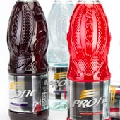
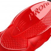
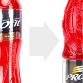
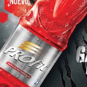
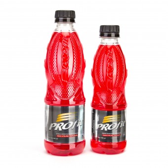
| DESIGN NAME: PROfit Sport Drink Packaging PRIMARY FUNCTION: Sports Drink Package INSPIRATION: When it came to the design creation of the new PROfit identity, we looked to athletic equipment for inspiration. We added a texture to the container that mimicked that of sports apparel and footwear. We used hard reactive looking shapes with safety pads in mind. We also wanted the bottle to look aggressive and modern with a new metallic label. UNIQUE PROPERTIES / PROJECT DESCRIPTION: The new packaging for PROfit was launched in early 2013, the brand identity and concept transitioned the product to a standalone iconic package that is aggressive, sporty, and modern. The packaging features a sport infused container with a highly reflective and clean label with ghosted attributes. Tying the two together is a hexagonal texturing feature on both. OPERATION / FLOW / INTERACTION: One unique feature to the bottle is the lowered location of the labeling panel. This was done in an effort to make a container that was more stable in a bicycle water bottle holder. The shape of the container also improves gripability with limited sight interaction. The textured surfaces also minimize slipping. PROJECT DURATION AND LOCATION: Project ideation originated at Amcor in October 2012. Final product was launched into the marketplace in March 2013. FITS BEST INTO CATEGORY: Packaging Design |
PRODUCTION / REALIZATION TECHNOLOGY: Injection Stretch Blow Molding (ISBM) process, using PET Plastic. Cold Fill Application. SPECIFICATIONS / TECHNICAL PROPERTIES: 500ml: Height: 215mm X Diameter: 65mm, 16.5g. PET 350ml: Height: 183mm X Diameter: 58mm, 15g. PET TAGS: Sports, Drink, Isotonic, Beverage, Container, Packaging, Hydration, Athletic, Modern, Unique, Production, Aggressive, Masculine, Sporty, Sport, Amcor, Toni, PROfit, RESEARCH ABSTRACT: Extensive research was done to improve the functionality of the packaging from Ergonomic studies, to container use constraints and goals. Through a thorough benchmarking study it was concluded that a container with improved gripability, solid contact points, aggressive styling, and bold statement was needed to create a highly competitive and athletic container. CHALLENGE: One of the most difficult parts of the design was coming up with a texture that was both producable and conveyed the correct athleticism that we felt the brand needed. It was decided that a Hexagonal patterning would blow as ADDED DATE: 2013-06-25 06:49:09 TEAM MEMBERS (5) : Lead/Industrial Designer: Jeff Klok, Graphic Designer: Luis Villalobos Jr. , Design Group Lead: Carlos Londono, Engineering Lead: Juan Milla and Toni Brand Manager: Carlos Pozo IMAGE CREDITS: Image #1 : Jeff Klok(Sr. Industrial Designer, Amcor), 2013 Image #2 : Jeff Klok(Sr. Industrial Designer, Amcor), 2013 Image #3 : Jeff Klok(Sr. Industrial Designer, Amcor), 2013 Image #4 : Jeff Klok(Sr. Industrial Designer, Amcor), 2013 Image #5 : Maruri (www.maruri.ec), 2013 Commercial Video : Maruri (www.maruri.ec), 2013 |
||||
| Visit the following page to learn more: http://www.amcor.com/businesses/rigid_pl |
|||||
| AWARD DETAILS | |
 |
Profit Sport Drink Packaging Sports Drink Package by Amcor Latam & Toni Ecuador is Winner in Packaging Design Category, 2013 - 2014.· Press Members: Login or Register to request an exclusive interview with Amcor LATAM & Toni Ecuador. · Click here to register inorder to view the profile and other works by Amcor LATAM & Toni Ecuador. |
| SOCIAL |
| + Add to Likes / Favorites | Send to My Email | Comment | Testimonials | View Press-Release | Press Kit |

