dieForm, stilhaus Rothrist Design/Sales Exhibition by Gessaga Hindermann GmbH |
Home > Winners > #29384 |
 |
|
||||
| DESIGN DETAILS | |||||
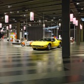
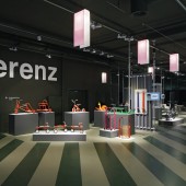
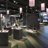
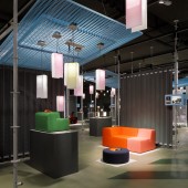
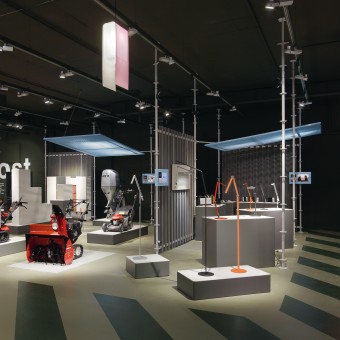
| DESIGN NAME: dieForm, stilhaus Rothrist PRIMARY FUNCTION: Design/Sales Exhibition INSPIRATION: For the design exhibition "dieForm" at the Stilhaus in Rothrist, Gessaga Hindermann have combined the wonderful world of the oriental bazaar with modern design and innovative technologies. With the result that there is a gratifying absence of ankle-biting sales people. UNIQUE PROPERTIES / PROJECT DESCRIPTION: It is both the design and the novel operational concept that make the "dieForm" exhibition so innovative. All of the products of the virtual showroom are physically on display. Visitors are distracted from the product neither by advertising nor sales staff. Additional information can be accessed at any time via app and mobile device. The concept allows an exciting range of products to be showcased while emphasising the product rather than the brand. OPERATION / FLOW / INTERACTION: The sales exhibition "dieForm" is all about the individual products on display. Visitors can browse in peace, without sales staff looking over their shoulder. Information about the product or brand can be accessed at any time via QR code and app. Products are no longer picked up centrally, they are ordered digitally and shipped to the customer. PROJECT DURATION AND LOCATION: The project started in January 2012 and opened in November 2012. The exhibition is located in the department store the Stilhaus in Rothrist, Switzerland. FITS BEST INTO CATEGORY: Interior Space and Exhibition Design |
PRODUCTION / REALIZATION TECHNOLOGY: Mobile partitions serve as dividers between exhibition spaces; they are made from flocked trapezoidal sheeting and painted struts, reminiscent of freight containers or constructions. The struts are connected to the suspended lighting rig, cleverly providing each exhibition space with power. The elements can be individually combined and meet all the requirements in terms of flexibility and individuality in product presentation. The matt grey podium provides the ideal platform and background for the product on display. The way is lit by individually designed lamps made from corrugated acrylic glass. SPECIFICATIONS / TECHNICAL PROPERTIES: The brief was to create a concept for an un-manned design/sales exhibition on a 3,500 m2 area in an existing department store. The design concept was to be based on a modular exhibition architecture comprising flexibly configurable and rentable spaces of 6.25 - 50 m2 for displaying alternating products. The spaces had to be affordable with rental contracts of a maximum of one year. The planning and curation of approximately 60 exhibitors and around 600 products was also part of the brief. TAGS: design exhibition, sales exhibition, product presentation, Gessaga Hindermann, dieForm, stilhaus RESEARCH ABSTRACT: Two factors were essential to the formal research; the urban structure and the temporary aspect of the exhibition architecture. A spatial analysis was conducted to determine which axes would work as main traffic axes for visitors. These were then painted to resemble pedestrian crossings to stand out from the rest of the presentation area. Scaffolding painted grey and polyamide-coated metal partitions are reminiscent of a construction site without appearing too rudimentary. CHALLENGE: Both the design and the operational concept are what make the idea of an un-manned sales exhibition with 60 brands so unique. Visitors are able to focus on the products on display without being distracted by advertising or sales staff. Visitors can digitally access more detailed information about brands and products at any time via QR code and app or on the website. The concept allows an exciting range of products to be showcased while emphasising the products themselves rather than the brand or marketing message. ADDED DATE: 2013-06-16 23:25:13 TEAM MEMBERS (3) : Jérôme Gessaga, Christof Hindermann and Reto Welz IMAGE CREDITS: Gessaga Hindermann GmbH , 2013. |
||||
| Visit the following page to learn more: http://www.dieform.ch | |||||
| CLIENT/STUDIO/BRAND DETAILS | |
 |
NAME: Stilhaus G, Rössliweg 48, CH-4852 Rothrist PROFILE: Department store in Rothrist, Switzerland. |
| AWARD DETAILS | |
 |
Dieform, Stilhaus Rothrist Design/Sales Exhibition by Gessaga Hindermann Gmbh is Winner in Interior Space and Exhibition Design Category, 2013 - 2014.· Press Members: Login or Register to request an exclusive interview with Gessaga Hindermann GmbH . · Click here to register inorder to view the profile and other works by Gessaga Hindermann GmbH . |
| SOCIAL |
| + Add to Likes / Favorites | Send to My Email | Comment | Testimonials | View Press-Release | Press Kit | Translations |

