Nankin Lab Corporate Design by Pau Garcia and Pol Trias |
Home > Winners > #29027 |
 |
|
||||
| DESIGN DETAILS | |||||
| DESIGN NAME: Nankin Lab PRIMARY FUNCTION: Corporate Design INSPIRATION: There is always a plan B, another way to play with our tools, that was our milestone, to really enjoy the way we were working with the images and objects through a whole concept of design studio. UNIQUE PROPERTIES / PROJECT DESCRIPTION: There is a rare pleasure in seeing a building collapse, in breaking a paper in a half, or blowing up a balloon. These are acts that sometimes last less than a second, and being so ephemeral, makes you run longuer in a shorter time. These are situations involving speed and high intensity. Nankin Lab is a design studio that recreates on these moments to generate new projects. OPERATION / FLOW / INTERACTION: - PROJECT DURATION AND LOCATION: The project started in 2013 in Barcelona and is still on going, we have been exhibiting in the International Graphic Design Festival of France: http://www.behance.net/gallery/Nankin-Lab-Exhibiti on/9251591 and we will act soon again in a gallery in Barcelona. |
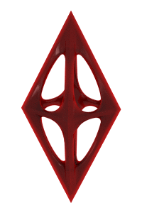
PRODUCTION / REALIZATION TECHNOLOGY: - SPECIFICATIONS / TECHNICAL PROPERTIES: The visual identity of the studio focuses on the first idea of Tangram graphic destruction. Using as main ingredients sans serif fonts and bold color harmony. TAGS: destruction, construction, yellow, rebuilding, nankin lab RESEARCH ABSTRACT: - CHALLENGE: The principal challenge to develop Nankin Lab was to integrate the physic essence of the brand with the digital side of it. ADDED DATE: 2013-03-30 05:32:33 TEAM MEMBERS (1) : Pau Garcia and Pol Trias IMAGE CREDITS: Image #1: Designer Pau Alekumsalaam, Nankin Lab Cards, 2012 // Image #2: Designer Pau Alekumsalaam, Nankin Lab Stationery, 2012 // Image #3: Designer Pau Alekumsalaam, Nankin Lab Stationery, 2012 // Image #4: Industrial Designer Pol Trias, Nankin Lab Double Pencil, 2012 // Image #3: Designer Pau Alekumsalaam, Nankin Lab Poster, 2012 |
||||
| Visit the following page to learn more: http://www.behance.net/gallery/Nankin-La |
|||||


| CLIENT/STUDIO/BRAND DETAILS | |
 |
NAME: Nankin Lab PROFILE: There is a rare pleasure in seeing a building collapse, in breaking a paper in a half, or blowing up a balloon. These are acts that sometimes last less than a second, and being so ephemeral, makes you run longer in a shorter time. These are situations involving speed and high intensity. Nankin Lab is an experimental design studio that recreates on these moments to generate new projects. |

| AWARD DETAILS | |
 |
Nankin Lab Corporate Design by Pau Garcia and Pol Trias is Winner in Graphics, Illustration and Visual Communication Design Category, 2013 - 2014.· Read the interview with designer Pau Garcia and Pol Trias for design Nankin Lab here.· Press Members: Login or Register to request an exclusive interview with Pau Garcia and Pol Trias. · Click here to register inorder to view the profile and other works by Pau Garcia and Pol Trias. |
| SOCIAL |
| + Add to Likes / Favorites | Send to My Email | Comment | Testimonials | View Press-Release | Press Kit |
Did you like Pau Garcia and Pol Trias' Graphic Design?
You will most likely enjoy other award winning graphic design as well.
Click here to view more Award Winning Graphic Design.
