Mad Drinkers Infographic by Mattia Parietti |
Home > Winners > #28847 |
 |
|
||||
| DESIGN DETAILS | |||||
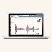
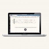
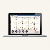
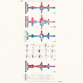
| DESIGN NAME: Mad Drinkers PRIMARY FUNCTION: Infographic INSPIRATION: It was developed during the Workshop Culture Data Culture held by Santiago Ortiz Herrera at Politecnico di Milano. During a pause we were chatting friendly about the latest episode of Mad Men. And we came out with a statement: Mad Men drink and smoke very heavily. That was the starting point, while we were not expecting an inspiration. UNIQUE PROPERTIES / PROJECT DESCRIPTION: The infographics, through a simple yet innovative web-based approach, enlightens the relationships between alcohol consumption, locations, time and trends in the first season of the TV series Mad Men. The project uses surface to visualize the relationship between the characters, the relative alcohol consumption, the length of a single episode and the time span of each episode. OPERATION / FLOW / INTERACTION: Given it is a website, interaction (scrolling, hover effects and little animations) is an instrument for better understanding. For example, the hover effect on the graphs permits the reader viewing single units of those graphs. PROJECT DURATION AND LOCATION: - |
PRODUCTION / REALIZATION TECHNOLOGY: - SPECIFICATIONS / TECHNICAL PROPERTIES: It was developed thinking about a web output, so it was designed thinking directly in terms of HTML5 and CSS3 possibilities. TAGS: infographic, data visualization, Mad Men, drinking habits, alcohol RESEARCH ABSTRACT: Data collected by watching every episode of the first season and gathering information about time, places, main characters' relations, drinking behavior and smoking behavior. Plus, additional info about cocktails and beverages in the 1960's and their alcohol percentage was added. All the data was gathered, processed and presented in five days. CHALLENGE: - ADDED DATE: 2013-03-05 08:16:07 TEAM MEMBERS (6) : Arianna Bellotti, Sofia Girelli, Daniele Lupatini, Gianluca Malimpensa, Mattia Parietti and Aurelie Pellat IMAGE CREDITS: Mattia Parietti, 2012. |
||||
| Visit the following page to learn more: http://www.maddrinkers.com | |||||
| AWARD DETAILS | |
 |
Mad Drinkers Infographic by Mattia Parietti is Winner in Graphics, Illustration and Visual Communication Design Category, 2012 - 2013.· Press Members: Login or Register to request an exclusive interview with Mattia Parietti. · Click here to register inorder to view the profile and other works by Mattia Parietti. |
| SOCIAL |
| + Add to Likes / Favorites | Send to My Email | Comment | Testimonials | View Press-Release | Press Kit |

