100 Bites Dessert Restaurant by Danny Chan |
Home > Winners > #27996 |
 |
|
||||
| DESIGN DETAILS | |||||
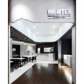
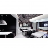
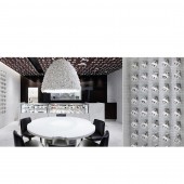
| DESIGN NAME: 100 Bites Dessert PRIMARY FUNCTION: Restaurant INSPIRATION: Taking bite as the design theme, graphic portraits, teeth models, celebrity head visuals are all key features help to stimulate the taste buds of every customer. From the fancy brown and white graphic ceiling, to the white super graphic wall, to the neatly arranged product display wall, together with the 100 biting icons representing different decades, a rich designed black humor flavor confuses. UNIQUE PROPERTIES / PROJECT DESCRIPTION: Bits and Bites Evoke The Taste of a Sweet Brand A bite remarks a body part that possesses the longest longevity, so every bite is a symbol of an individual that represents a unique taste. At here, all good tastes from all walks of lives are assured with the hundred bites collected. Taking white mosaic walls and flooring as a contrast to the brown glass walls, it creates a sense of modern nostalgia for accommodating all the bites over the ceiling. Making fun of a hundred famous figures by adding a signature bite for them, these biting icons set up a very unique and interesting atmosphere to the space. Sipping through the simple modern chic, there lies a sense of black humor. Desserts are the key products in this space, which aligned well with the positive energy offered by the humorous design. Taking bite as the design theme, graphic portraits, teeth models, celebrity head visuals are all key features help to stimulate the taste buds of every customer. From the fancy brown and white graphic ceiling, to the white super graphic wall, to the neatly arranged product display wall, together with the 100 biting icons representing different decades, a rich designed black humor flavor confuses. In the dining hall, bites are everywhere: on the wall, on the tables, on the cups, on the ceiling. The mirror Mao-shaped super graphic becomes the most eye-catching wall feature in the space. Pendant lights made up with hundreds of fake teeth sets echoing the bite design on the table are highlighting the design symbols hanging above the booth seats area and the big table in front of the dessert bar that creates a suspicious mood for the space. In front of the show kitchen, a long white marble dessert bar is designed to present 100 desserts to please the dessert lovers. Next to the dessert bar, there is a key signature white wall arranging with a 100 white cups carrying a 100 icons. This is a unique lively art exhibition in a way of product display. The contrasting key colors of coffee brown and pure white provide an impressed ground for every designed icon. Booth seats are designed like 3 leathered boxes inserted into a time tunnel to provide private spaces where designed biting icons from different decades are lining up on the walls right above the tables. When customers are sitting next to enjoy the desserts and coffee, those special graphic expressions highlighted by the back-lit lights would definitely help to boost up their appetites and eating moods. Funny and humor is not only the composition of the design, but creating a commercial branding value to the space. A product display cabinet is set at the freestanding cashier, where provides a chance for customers to privatize the space by owning the designer cups and plates sealed with the biting icons. At here, art and design becomes a total branding package to light up the space and bring up a unique memorable customer experience. OPERATION / FLOW / INTERACTION: In the dining hall, bites are everywhere: on the wall, on the tables, on the cups, on the ceiling. The mirror Mao-shaped super graphic becomes the most eye-catching wall feature in the space. Pendant lights made up with hundreds of fake teeth sets echoing the bite design on the table are highlighting the design symbols hanging above the booth seats area and the big table in front of the dessert bar that creates a suspicious mood for the space. In front of the show kitchen, a long white marble dessert bar is designed to present 100 desserts to please the dessert lovers. Next to the dessert bar, there is a key signature white wall arranging with a 100 white cups carrying a 100 icons. This is a unique lively art exhibition in a way of product display. The contrasting key colors of coffee brown and pure white provide an impressed ground for every designed icon. Booth seats are designed like 3 leathered boxes inserted into a time tunnel to provide private spaces where designed biting icons from different decades are lining up on the walls right above the tables. When customers are sitting next to enjoy the desserts and coffee, those special graphic expressions highlighted by the back-lit lights would definitely help to boost up their appetites and eating moods. Funny and humor is not only the composition of the design, but creating a commercial branding value to the space. A product display cabinet is set at the freestanding cashier, where provides a chance for customers to privatize the space by owning the designer cups and plates sealed with the biting icons. At here, art and design becomes a total branding package to light up the space and bring up a unique memorable customer experience. PROJECT DURATION AND LOCATION: The project started in November 2011 and finished in September 2012 in Shop No. 21-23, Level 10, Langham Place, 8 Argyle Street, Mong Kok, Hong Kong FITS BEST INTO CATEGORY: Interior Space and Exhibition Design |
PRODUCTION / REALIZATION TECHNOLOGY: - SPECIFICATIONS / TECHNICAL PROPERTIES: - TAGS: Bits and Bites Evoke The Taste of a Sweet Brand RESEARCH ABSTRACT: - CHALLENGE: - ADDED DATE: 2013-02-22 00:53:06 TEAM MEMBERS (2) : Danny Chan (Director) and Steve Fong (Senior Interior Designer) IMAGE CREDITS: Danny Chan, 2012. |
||||
| Visit the following page to learn more: http://www.beige.com.hk/ | |||||
| AWARD DETAILS | |
 |
100 Bites Dessert Restaurant by Danny Chan is Winner in Interior Space and Exhibition Design Category, 2012 - 2013.· Read the interview with designer Danny Chan for design 100 Bites Dessert here.· Press Members: Login or Register to request an exclusive interview with Danny Chan. · Click here to register inorder to view the profile and other works by Danny Chan. |
| SOCIAL |
| + Add to Likes / Favorites | Send to My Email | Comment | Testimonials | View Press-Release | Press Kit | Translations |
Did you like Danny Chan's Interior Design?
You will most likely enjoy other award winning interior design as well.
Click here to view more Award Winning Interior Design.


