|
|
|

|
|
| DESIGN DETAILS |
DESIGN NAME:
Il Mosnel QdE 2012
PRIMARY FUNCTION:
Sparkling Wine Label and Pack
INSPIRATION:
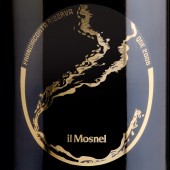
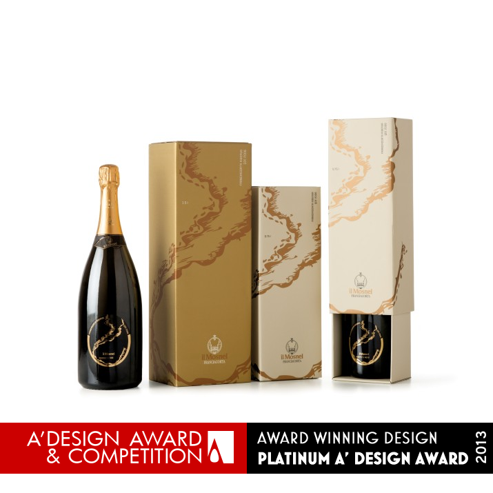
Just as the Iseo Lake splashes on the banks of Franciacorta, so the sparkling wine wets the sides of a glass.
This concept arises from the graphic re-elaboration of the historical image representing the shape of the lake, and expresses all the power with which a freshly uncorked Reserve bottle is poured into a crystal glass.
The little bubbles mix in the jet of the sparkling wine and create an expectation, an emotion which awakens a desire to open the bottle.
UNIQUE PROPERTIES / PROJECT DESCRIPTION:
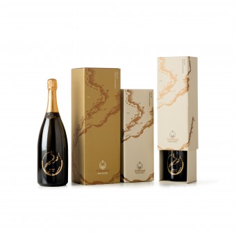
An elegant label which is balanced in its graphics and colors and in the combination with a modern font as Anorak, that is perfectly integrated, but at the same time distinct from the original elements of the label.
A daring solution was used with a transparent polypropylene to give new sensations: entirely hot foil gold printing to enhance the elegance of the product.
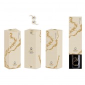
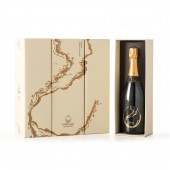
The powerful pouring out of the sparkling wine is underlined on the box, where the graphics wraps around the packaging.
OPERATION / FLOW / INTERACTION:
-
PROJECT DURATION AND LOCATION:
This project is the winner of the prestigious Award The Mosnel “Questione d’Etichetta” - now in its fourth edition and promoted by the historic winery in Franciacorta with the partnership of ADI.
FITS BEST INTO CATEGORY:
Packaging Design
|
PRODUCTION / REALIZATION TECHNOLOGY:
-
SPECIFICATIONS / TECHNICAL PROPERTIES:
-
TAGS:
sparkling wine, laura ferrario il mosnel, QdE 2012, ferrariodesign il mosnel, Questione d'etichetta 2012
RESEARCH ABSTRACT:
-
CHALLENGE:
-
ADDED DATE:
2013-02-19 06:49:25
TEAM MEMBERS (1) :
IMAGE CREDITS:
Laura Ferrario, 2012.
|
|
| CLIENT/STUDIO/BRAND DETAILS |
 |
NAME:
FERRARIODESIGN
PROFILE:
My studio specializes in visual communication consultancy for companies and in this we assist the customer at 360 °: logo design, corporate identity, catalogs, brochures, exhibition design, packaging and web design.
I’ve been working as a Graphic Designer for over 20 years, aiming to face every single project by asking: who is the message to be communicated aimed at and how can I reach the end user in the simplest and most immediate way.
In fact, the phrase that represents me is: "For all companies who want to keep up with the pace of the world, but attract the gaze of those watching". To achieve this in a society full of visual inputs, it is necessary to strike immediately to be recognized with a few well-directed messages.
Creativity is being able to attract attention through the visual message and make people stop, even just for a moment. It’s being remembered!
In a world where everyone is racing to go faster it’s important to understand how things are being observed and the importance of providing a clear communication and a strong visual impact.
Here is the winning approach, adopted over the years for the most diverse clients, who have enabled me to maintain an open mind and that creative freshness needed to guarantee solutions that are never obvious or predictable.
Because working every day in different sectors means having one single specialization, that of quality.
|
|
|
| COMMENTS |
| Giulia Esposito |
Comment #744 on December 24, 2022, 2:35 pm |
|
I'm awestruck by the brilliance of this work! The packaging design for "Il Mosnel QdE 2012" is absolutely stunning. The use of vibrant colors, the intricate patterns and the remarkable typography all come together to form a truly unique and captivating design. It's a work of art that is both visually stunning and highly functional. This is the perfect example of how packaging design can be used to create a powerful brand identity and an unforgettable experience. Congratulations to Laura Ferrario for the A' Design Award win!
|
| Walter Graham |
Comment #16426 on January 3, 2023, 4:40 am |
|
I am absolutely in awe of Laura Ferrario's work and their achievement of winning the Platinum A' Design Award. Their design for "Il Mosnel QdE 2012" showcases impeccable craftsmanship with its elegant graphics, colors, and combination with a modern font. The use of transparent polypropylene and hot foil gold printing adds a unique touch to the label and packaging, making it truly stand out. The powerful pouring out of the sparkling wine is also highlighted on the box, which is another testament to their design excellence.
This award is a true representation of their hard work, dedication and passion for design. I would like to express my sincere admiration for Laura Ferrario's accomplishment and wish them the best of luck for future endeavors.
|
| Thomas Anderson |
Comment #16823 on January 3, 2023, 4:58 am |
|
The design of Il Mosnel QdE 2012 Sparkling Wine Label and Pack is truly remarkable! This clever combination of classic and modern elements creates a timeless and sophisticated look. The bold use of gold foil enhances the elegance of the product, while the transparent polypropylene brings about a unique sensation. The graphics wrapping around the box also captures the power of a freshly uncorked bottle of sparkling wine. It is clear that the designer was inspired by the Iseo Lake, and the result is truly stunning. This award-winning packaging design is truly a work of art. Congratulations to the designer for their achievement!
|
| Chloe Turner |
Comment #17098 on January 3, 2023, 5:09 am |
|
As a design enthusiast, I am truly captivated by the beauty of the sparkling wine label and pack designed by Laura Ferrario. The inspiration behind this work – the Iseo Lake splashing on the banks of Franciacorta – is perfectly captured in the graphic re-elaboration of the historical image that expresses all the power of the Reserve bottle. The little bubbles in the jet of the sparkling wine create an anticipation and emotion that can be felt from just looking at the design. The attention to detail, the colors and the texture of the label and pack come together to make an amazing design that is worthy of the A' Design Award.
|
| Paul Phillips |
Comment #17288 on January 3, 2023, 5:15 am |
|
The work of "Il Mosnel QdE 2012" is truly remarkable! The packaging design has a perfect balance of graphics and colors, and the modern font Anorak is seamlessly integrated yet distinct from the original elements. The use of transparent polypropylene and hot foil gold printing adds to the elegance of the product and the powerful pouring out of the sparkling wine is highlighted in the wrapping graphics of the packaging. This work is a testament to the creativity and talent of the designer, and it is no surprise that it was recognized with the A' Design Award.
|
| Stefano Moretti |
Comment #19741 on January 3, 2023, 6:11 am |
|
This award-winning work exudes sophistication and elegance, with its balanced graphics and colors, modern font and transparent polypropylene. The box wraps around the packaging to emphasize the powerful pouring out of the sparkling wine. The re-elaboration of the historical image representing the shape of the lake expresses the emotion and anticipation of opening the bottle.
|
| Patricia Miller |
Comment #21686 on January 3, 2023, 6:48 am |
|
This award-winning work showcases a sophisticated combination of modern graphics, colors and a distinct font, that creates a powerful yet elegant design.
|
| Elena Petrenko |
Comment #21923 on January 3, 2023, 6:53 am |
|
This sparkling wine label and pack is a daring yet elegant solution, combining modern font and hot foil gold printing to create an exciting expectation.
|
| Anna Ivanova |
Comment #63337 on January 3, 2023, 11:38 pm |
|
I am delighted to see that Laura Ferrario has achieved such a prestigious award for her "Sparkling Wine Label and Pack" design. This is a remarkable achievement and I commend her for her creativity and hard work.
|
| Haruka Abe |
Comment #81294 on January 4, 2023, 8:38 am |
|
Congratulations to Laura Ferrario on winning the Platinum A' Design Award for her exceptional work on the "Il Mosnel QdE 2012" Sparkling Wine Label and Packaging Design.
|
|
|
Did you like Laura Ferrario's Packaging Design?
You will most likely enjoy other award winning packaging design as well.
Click here to view more Award Winning Packaging Design.
Did you like Il Mosnel Qde 2012 Sparkling Wine Label and Pack? Help us create a global awareness for good packaging design worldwide. Show your support for Laura Ferrario, the creator of great packaging design by gifting them a nomination ticket so that we could promote more of their great packaging design works.
|
|
|
|
|
|
