Compass – school in Crete Bioclimatic European School Complex by officetwentyfive architects

Home > Winners > #27476


DESIGN DETAILS
DESIGN NAME:
Compass – school in Crete

PRIMARY FUNCTION:
Bioclimatic European School Complex

INSPIRATION:
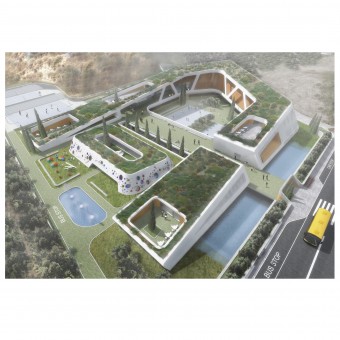
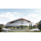
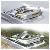
The shape of the school is essentially an arrow that shows the path that the couple God Zeus and Europe followed due to the myth.Our building is acting as a memorial connecting a myth with reality.We wanted to create an international shape, an arrow that will point toward the rest of Europe, origin and destination of the future students of the school and a constant reference of where Crete belongs now.

UNIQUE PROPERTIES / PROJECT DESCRIPTION:
From the beginning of our design we felt that we had to balance between two facts: The one is that the school is European, has an international and cultural character and the second is that at the same time it is located in a landscape with a strong ''locality'' and thousands of years of history lost in the mists of legends and traditions. From this place started God Zeus transformed into a bull trying to steal Europe. The years passed, Europe gave its name to a continent and the island of Crete is the southernmost part of the continent. Our building is actually acting as a memorial connecting a myth with reality. We wanted to create an international shape, an arrow that will point toward the rest of Europe, origin and destination of the future students of the school and a constant reference of where Crete belongs now. We used the white color, an international and basic color that excludes any reference to world localities. The walls are engraved with European alphabets as a reference to integration and unification rather than division. Obviously, one of the alphabets are the symbols of the ''disk of Phaistos'' stimulating the pride of students who will learn that the first written text in Europe was written only a few kilometers from their school. Furthermore, the louvers of the school is a topic that concerned us a lot. As we have many louvers in our building we wanted to avoid the need of their frequent maintenance. We decided to use clay as their constructing material and the local craftsmen to construct them and revive an art which used to exist in the region thousands of years ago and nowadays leans to disappear. We paint them though white in order to stay faithful to our primary concept of internationality of the design but also retaining hidden the traditional principles and the power of the location. Our building follows the dictates of the international style, however, at second thought we can understand that it draws its power from the Earth in which it stands. We wanted our school to be multicultural but not impersonal and cold. It could be located anywhere but where would make as much sense the fact that it shows towards the North, it is white, it has the symbols from the ''disk of Phaistos'' and has the specific louvers and not some other. It is international and multicultural but with respect to the place where it is located.

OPERATION / FLOW / INTERACTION:
-

PROJECT DURATION AND LOCATION:
The competition started in August of 2012 and ended in November 2012. The School is located in Heraklion , of Crete in Greece

FITS BEST INTO CATEGORY:
Architecture, Building and Structure Design

PRODUCTION / REALIZATION TECHNOLOGY:
-

SPECIFICATIONS / TECHNICAL PROPERTIES:
The total area of all the levels is 7500 m²

TAGS:
european, Innovative, Bioklimatic, myth of God Zeus and Europe, School, OFFICETWENTIFIVEARCHITECTS, o25,

RESEARCH ABSTRACT:
-

CHALLENGE:
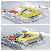
The hardest part of this challenge was to create an attractive school to the users of it,especially the kids. We had to establish the hole volume in a Mediterranean site The building is located in an olive grove. The Cretan nature is unique, so we use local plants in the gardens around the school. It is an opportunity for children who live and grow up in the city to have this experience with nature. The passage from indoors spaces to the outdoor spaces is direct and only in the secondary school department there are areas where there is the need for someone to descend a staircase in order to go outdoors. Each level of education within the building operates independently. In the center of the complex we located the kindergarten, protected from both wings like a hug. In that way, we protect and secure the younger children of the school, who for the first time leave their homes and create for them an environment of introverted. In the kindergarten department there is also an enclosed courtyard, a sheltered space where kids play and adapt to the new data with security. The primary school is located on the lower level of the school. It has a courtyard with one entry-exit point. All classes of the primary school have direct access to the courtyard and the kids of primary school can have the independence that they want. There are no staircases inside and outside the school and an independent, controlled and protected area is created. The students of secondary school due to the fact that they are the older students of the school want their independence. The classrooms of the secondary school are placed in the two highest level of the school building. While the students enter the school they pass through a courtyard from where they can see the kindergarten and the primary school through a short but daily look.

ADDED DATE:
2013-01-31 08:38:32

TEAM MEMBERS (11) :
MANOLIS VOURAKIS, ANTONIS PERPATIDIS , THANASIS CHRYSOMALLIS , KATERINA RAPTI, VASILIS NIKOLOPOYLOS, ARIADNI PARISI, VASILIS VAVOUJIOS, ELENA PAPAGEORGIOY, ELENI THEODORIDOU, DESIPRIS GIANNIS and

IMAGE CREDITS:
officetwentyfive architects, 2012.

Visit the following page to learn more: http://www.o25.gr


CLIENT/STUDIO/BRAND DETAILS
NAME:
OFFICE 25 ARCHITECTS

PROFILE:
The practice was formed in 2003 by Thanasis Chrysomallis, Antonis Perpatidis and Manolis Vourakis. Since then, Office 25 Architects has developed a successfull approach on the market, expanding not only their workforce but their locus as well. The practice operates in a project-oriented network structure. At every project stage, we team up discussing, researching and drawing, to develop the concept of each project. The variety of projects that the practice undertakes has been a well-considered decision. It could easily switch from competition design projects to private housing developments which will be accomplished in the best possible timeframe, always with respect to the aesthetics of each work.


NOMINATION DETAILS

Compass – School in Crete Bioclimatic European School Complex by Officetwentyfive Architects is a Nominee in Architecture, Building and Structure Design Category.

· This project is currently confidential as results have not been announced yet. Images and further details of the project is not available for public yet, please check back later. If you are the owner of this design, please login to view the images.

· Click here to register today inorder to be able to view the profile and other works by officetwentyfive architects when results are announced.


AWARD DETAILS

Compass – School in Crete Bioclimatic European School Complex by Officetwentyfive Architects is Winner in Architecture, Building and Structure Design Category, 2012 - 2013.


· Press Members: Login or Register to request an exclusive interview with officetwentyfive architects.

· Click here to register inorder to view the profile and other works by officetwentyfive architects.


SOCIAL
+ Add to Likes / Favorites | Send to My Email | Submit Comment | Comment | Testimonials | View Press-Release | Press Kit


Did you like Officetwentyfive Architects' Architecture Design?
You will most likely enjoy other award winning architecture design as well.
Click here to view more Award Winning Architecture Design.


Did you like Compass – School in Crete Bioclimatic European School Complex? Help us create a global awareness for good architecture design worldwide. Show your support for Officetwentyfive Architects, the creator of great architecture design by gifting them a nomination ticket so that we could promote more of their great architecture design works.

See other A' Design Award and Competition WinnersA' Design Award Presentation Submit Your Designs
 
design award logo

BENEFITS
THE DESIGN PRIZE
WINNERS SERVICES
PR CAMPAIGN
PRESS RELEASE
MEDIA CAMPAIGNS
AWARD TROPHY
AWARD CERTIFICATE
AWARD WINNER LOGO
PRIME DESIGN MARK
BUY & SELL DESIGN
DESIGN BUSINESS NETWORK
AWARD SUPPLEMENT

METHODOLOGY
DESIGN AWARD JURY
PRELIMINARY SCORE
VOTING SYSTEM
EVALUATION CRITERIA
METHODOLOGY
BENEFITS FOR WINNERS
PRIVACY POLICY
ELIGIBILITY
FEEDBACK
WINNERS' MANUAL
PROOF OF CREATION
WINNER KIT CONTENTS
FAIR JUDGING
AWARD YEARBOOK
AWARD GALA NIGHT
AWARD EXHIBITION

MAKING AN ENTRY
ENTRY INSTRUCTIONS
REGISTRATION
ALL CATEGORIES

FEES & DATES
FURTHER FEES POLICY
MAKING A PAYMENT
PAYMENT METHODS
DATES & FEES

TRENDS & REPORTS
DESIGN TRENDS
DESIGNER REPORTS
DESIGNER PROFILES
DESIGN INTERVIEWS

ABOUT
THE AWARD
AWARD IN NUMBERS
HOMEPAGE
AWARD WINNING DESIGNS
DESIGNER OF THE YEAR
MUSEUM OF DESIGN
PRIME CLUBS
SITEMAP
RESOURCE

RANKINGS
DESIGNER RANKINGS
WORLD DESIGN RANKINGS
DESIGN CLASSIFICATIONS
POPULAR DESIGNERS

CORPORATE
GET INVOLVED
SPONSOR AN AWARD
BENEFITS FOR SPONSORS
IMPRESSUM IMPRINT

PRESS
DOWNLOADS
PRESS-KITS
PRESS PORTAL
LIST OF WINNERS
PUBLICATIONS
RANKINGS
CALL FOR ENTRIES
RESULTS ANNOUNCEMENT

CONTACT US
CONTACT US
GET SUPPORT

Good design deserves great recognition.
A' Design Award & Competition.