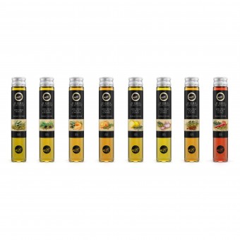
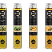
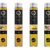
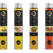
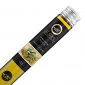
D'oro Extra Virgin Olive Oils Range by Guilherme Jardim |
Home > Winners > #26898 |
| CLIENT/STUDIO/BRAND DETAILS | |
 |
NAME: Mirajank & Co PROFILE: Mirajank Inc. is a trading company that specializes in fine wine and extra virgin olive oil import from Iberian Peninsula. |
| AWARD DETAILS | |
 |
D'oro Extra Virgin Olive Oils Range by Guilherme Jardim is Winner in Packaging Design Category, 2012 - 2013.· Press Members: Login or Register to request an exclusive interview with Guilherme Jardim. · Click here to register inorder to view the profile and other works by Guilherme Jardim. |
| SOCIAL |
| + Add to Likes / Favorites | Send to My Email | Comment | Testimonials | View Press-Release | Press Kit |

