DESIGN NAME:
Agraz Restaurant
PRIMARY FUNCTION:
Corporate Identity
INSPIRATION:
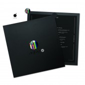
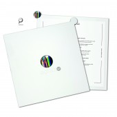
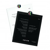
Agraz Restaurant’s brand inspired by Brazil’s twenty-seven states. The round symbol was inspired by the center of the Brazilian flag. The colors represent the miscegenation, diversity and the meeting of cultural globalization at the hotel. The dimensions of the stripes were inspired by the density of the population within each Brazilian state. The logo was applied to the menu in three-dimensional form creating a sensory effect. A white menu for women and a black one for men was a part of innovation.
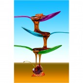
Tastes meet the spice of imagination! The new chef of Agraz restaurant presented a culinary inspired in the fusion of condiments of different regions of Brazil and all over the world. We took this new proposition from the chef to create a colorful institutional campaign, full of happy feelings, thinking about the miscegenation, the colorful logo, and at the same time conveying this fusion. The fusion of the condiments and its different colors, such as cumin, paprika and others were great contributors to our starting. The colorful concept of the brand arrives to the institutional campaign thru manipulated lucid images.
UNIQUE PROPERTIES / PROJECT DESCRIPTION:
The menus for lunch, dinner, breakfast, desserts, pool menu and placemats. Eco-Friendly- the menu’s base is permanent and when necessary the adhesive content of the menu can be substituted. We develop a institutional campaign for six months to show the new concept of the restaurant. In order to better understand the campaign sees the PDF archive.
OPERATION / FLOW / INTERACTION:
Menus enable a sensorial experience by means of the texture of the material and logo application in resin, which gives it a three D effects. Another example of interaction is the difference in the color of the menus, black menus for men and white menus for women.
PROJECT DURATION AND LOCATION:
This project spend almost six months. One month for the creation, three months for the research of materials and two months for the final production of the menus. This project are be using in the restaurants of Caesar Park hotels in São Paulo
FITS BEST INTO CATEGORY:
Graphics, Illustration and Visual Communication Design
|
PRODUCTION / REALIZATION TECHNOLOGY:
Breakfast, lunch, dinner and dessert menus were made from two millimeters polyethylene, covered with router-cut, post-consumer polypropylene in black and white. For the institutional campaign we created a acrylic display for the tend card. Flyers, postcards and elevator media were produced in paper. For the banner’s we used canvas.
SPECIFICATIONS / TECHNICAL PROPERTIES:
menu for lunch and dinner: 31,5 cm x 31,5 cm
menu for desserts: 18,5 cm x 15 cm
menu for breakfast: 22,5 cm x 20 cm
menu for pool (snacks and drinks): 30.5 cm - diameter
TAGS:
Branding design, logo, sensorial design. menu design, placemats, hotel and resorts, brazil, restaurant, Marcelo lopes designer
RESEARCH ABSTRACT:
The research conducted in this project involved the materials used – it was very important for the menus to be produced with resistant material for duration purposes, and for the menus always to seem new. The purpose of adding a sensorial experience to the menu increased our pursuit for innovative solutions. Another relevant issue was finding a solution for a menu with long-term use, whose content would nevertheless undergo constant changes. For this reason, we researched several materials to be applied on the base of the menu with an adhesive including the relevant content – in the event of any change, it is only necessary to replace the stick-on portion.
CHALLENGE:
The most challenging portion of the project was developing the base for the menus, finding the perfect balance between design and technology. We tested several materials to be cut: some of the materials had no resistance to laser cuts, whereas others, though they could be laser cut, were not as long-lasting. The decision to router-cut the material also resulted in additional difficulties – especially with respect to the production process, for polypropylene is not easily glued. Finding the adhesive that also had good adherence to the material took a full week’s time. Once handled, most adhesives eventually left marks on the menu, which thus would prevent the material from always looking new. Finding the appropriate materials for the project took three times longer than developing the creative project. The concept of adding a sensorial and three D touch to the material resulted in the development of a label in resin with the restaurant’s logo, to be applied on the menu.
ADDED DATE:
2012-09-26 12:37:29
TEAM MEMBERS (1) :
IMAGE CREDITS:
Marcelo Lopes Design, 2012.
|
