Yoshinoya Fast Food Restaurant by AS Design |
Home > Winners > #26510 |
 |
|
||||
| DESIGN DETAILS | |||||
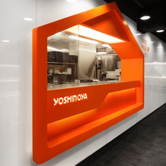
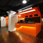
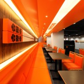
| DESIGN NAME: Yoshinoya PRIMARY FUNCTION: Fast Food Restaurant INSPIRATION: Chic Home UNIQUE PROPERTIES / PROJECT DESCRIPTION: Designers Four Lau & Sam Sum used “Home” as the core design element to build a “Chic Home”, presenting the brand image as young, energetic, and warm. The shape of “House” created a marker that makes the customers easily associated with the new image “Home”. Giant Japanese chopsticks, Japanese wooden plate menus, and levels of distinctive colors have become the new image elements of Yoshinoya fast food chain. High malleability and varied house-shaped design could link different areas and makes the spaces more stereoscopic. The design of geometric triangles on the wall creates a diversity of design styles, was inspired by Japanese origami. It makes the “Home” vivacious and creates a relaxing and lively environment for dining. OPERATION / FLOW / INTERACTION: “We want customers to understand at the first glance, being simple and direct would make more sense.” The idea of “Chic Home” does not only make the organization to flow with the trend and also to create the “Feel at home” to the stores. The enterprise provides not only high quality food and services, but all productions are of “Quality With Conscience”, including the restaurant environment. It also brings out a people-oriented attitude and a steady sustainable development to the industry. PROJECT DURATION AND LOCATION: The project finished in July 2012 in Hong Kong. FITS BEST INTO CATEGORY: Interior Space and Exhibition Design |
PRODUCTION / REALIZATION TECHNOLOGY: MATERIALS: Artificial Stone, Tiles, Glass, Back Paint Glass, Stainless steel, Powder Coating Metal, Leather, and Plastic Laminate. Seating accommodation: 258 Seats SPECIFICATIONS / TECHNICAL PROPERTIES: DIMENSIONS :4880 SQ FT TAGS: Chic Home, Yoshinoya, Japanese Fast Food Restaurant, AS design service ltd, Four Lau , Sam Sum, Hong Kong RESEARCH ABSTRACT: Positioned at a rapidly growing market, fast food corporations often targeted at the younger generations. Designers deliberately used the most direct and simple interpretation to demonstrate the image as innovative, apparent, and young. CHALLENGE: The biggest challenge of the project is that, having a long history, the brand’s trademark and main color is well understood by the general public, we tried to create a new emblem for the brand while keeping the original elements and to be innovative. This new emblem has to be simple and easy to understand, while leaving a deep impression and high malleability, varied and interesting. The main competitors with a strong trademark in the market made essential changes to the main colors, but our client did not allow such a change, but only to add new emblem and more colors. They also considered the linkage between traditional Japanese cultures to a part of the design but not too traditional; it made the design more difficult. ADDED DATE: 2012-09-18 20:44:54 TEAM MEMBERS (1) : Four Lau (Creative Director) , Sam Sum (Art Director) and Francis Wong (Assistant Interior Designer) IMAGE CREDITS: AS Design, 2012. |
||||
| Visit the following page to learn more: http://www.yoshinoya-hk.com/ | |||||
| AWARD DETAILS | |
 |
Yoshinoya Fast Food Restaurant by as Design is Winner in Interior Space and Exhibition Design Category, 2012 - 2013.· Read the interview with designer AS Design for design Yoshinoya here.· Press Members: Login or Register to request an exclusive interview with AS Design. · Click here to register inorder to view the profile and other works by AS Design. |
| SOCIAL |
| + Add to Likes / Favorites | Send to My Email | Comment | Testimonials | View Press-Release | Press Kit |
Did you like As Design's Interior Design?
You will most likely enjoy other award winning interior design as well.
Click here to view more Award Winning Interior Design.


