DESIGN NAME: Amur Vodka
PRIMARY FUNCTION: Vodka Bottle
INSPIRATION: We got inspired by the purity of the Siberian nature and by the Amur River.
The main goal was to represent the modern East Siberia in the design of this bottle.
UNIQUE PROPERTIES / PROJECT DESCRIPTION: This is a bottle designed exclusively for the brand AMUR VODKA.
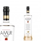
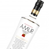
The shape of the bottle is elegant and simple, but with a strong presence at the same time.
The graphics are simple and elegant and inspired in the AMUR RIVER, which is always present in several design details.
The logotype is a representation of the river. The golden part represents the Russian Siberia and the red part represents China.
Note that the distillery is located in Khabarovsk, a city located on the border between Russia and China, 2 countries separated by the Amur River.
The River is also represented in gold, on the capsule.
Cap is made by cork.
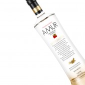
Typography is simple, sans serif, modern and easy to read. You can read in russian language Amur's Vodka, in a reference to the origin of the product, also represented by the map of Russian Federation with a red dot in the city of Khabarovsk, from where the product comes from.
On the front face you can also read a short description of the product and of the origin.
On the bottle you can see a gradient from gold to transparency. The gold represents the premium characteristics of the product.
OPERATION / FLOW / INTERACTION: -
PROJECT DURATION AND LOCATION: -
FITS BEST INTO CATEGORY: Packaging Design
|
PRODUCTION / REALIZATION TECHNOLOGY: Glass bottle and cork cap.
SPECIFICATIONS / TECHNICAL PROPERTIES: 427 cm
750 ML
TAGS: Vodka, Bottle, Packaging, Russia, Siberia, Portugal
RESEARCH ABSTRACT: -
CHALLENGE: -
ADDED DATE: 2012-09-10 08:53:14
TEAM MEMBERS (2) : Creative Direction: Guilherme Jardim and Designers: Guilherme Jardim and Pedro André
IMAGE CREDITS: Guilherme Jardim, 2012.
|