DESIGN NAME:
Apartment in Athens
PRIMARY FUNCTION:
Renovation
INSPIRATION:
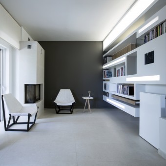
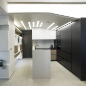
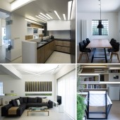
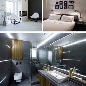
This ground floor apartment, nestled behind a mature lush garden, was completely gutted and transformed into this modern environment. Measuring 85s.m., the apartment features unique architectural designs, the use of natural materials (such as travertine and wood), a bold grey paint contrasted with white, softened by natural light and highlighted with concealed and exposed LED lighting, plus some industrially inspired design elements.
UNIQUE PROPERTIES / PROJECT DESCRIPTION:
The centerpiece to the home is made up of a curved kitchen ceiling that begins behind the wall cabinet and ends at the main feature of the space, a hanging bookcase with a concealed work desk. This unit separates the kitchen and passageway from the entry and den of the home. This one of a kind, custom designed and site-built unit literally hangs from the ceiling and was constructed using metal square tubing and gypsum board. It functions as a space divider and features a double-sided bookcase and desk, which swings in to be tucked away or swings out to be opened for use. It also has cleverly designed storage spaces, a completely flush built-in digital screen to play a slideshow of photos, a flat-screen LCD TV facing the kitchen and also conceals all the AV equipment for the multi-room sound system. As there are no legs for support, stools can also be stored underneath.
OPERATION / FLOW / INTERACTION:
Openings create interactive perspectives. Those perspectives are critical for the harmony of the apartments space. For example, the openings within the structure visually connect the main entrance/den area to the kitchen/rear passage way. At the same time, the structure physically separates both spaces, but with lots of opening space above and below, form and function come together in perfect harmony. The size of each opening depends on the degree of privacy required. For instance, from the perspective of the main entry looking in, the opening towards the bedroom side is much smaller, (like the opening on fortress wall), than the cutout optically connecting the kitchen to the main entry. The various cutouts, along with the different textures in material (white brick, grey lacquer) and lighting effects, create an architectural collage.
PROJECT DURATION AND LOCATION:
Three months, Athens- Koropi
FITS BEST INTO CATEGORY:
Interior Space and Exhibition Design
|
PRODUCTION / REALIZATION TECHNOLOGY:
Gypsum board allowed for the design and incorporation of concealed LED lighting (tucked behind white plexi-glass covers), built-in speakers, storage compartments and flush mounted LCD screens. The lighting, as with all other components, have been designed according to the main concept that all the parts must function as a whole and interact seamlessly with each other. It is this guiding philosophy that inspired the design of this interactive unit within the given space.
SPECIFICATIONS / TECHNICAL PROPERTIES:
85s.m.
TAGS:
Interior design, Studio NL, Athanasia Leivaditou
RESEARCH ABSTRACT:
-
CHALLENGE:
-
ADDED DATE:
2012-08-30 00:30:31
TEAM MEMBERS (1) :
Photographer: Vassilis Makris
IMAGE CREDITS:
Athanasia Leivaditou, 2012.
|


