DESIGN NAME:
Light Design Center Speyer, Germany
PRIMARY FUNCTION:
Lighting Exhibition and Shop
INSPIRATION:
For this purpose, nature created a unifying shape as inspiration: the „twister“, a natural phenomenon with invisible forces which make nearly everything float and which, at the same time, cause new aesthetics of spiral sailing.
UNIQUE PROPERTIES / PROJECT DESCRIPTION:
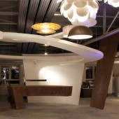
The showroom of the new Light Center Speyer, situated in a factory building, was to be designed as exhibition space, consulting area and meeting place. Here, a frame generating interior design synergy effects was to be created for all latest light trends, technologies and light designs. Its sophisticated structure was to build the backbone of the entire light exhibition, but at the same time was never to overshadow the priority of the lighting objects to be exhibited. For this purpose, nature created a unifying shape as inspiration: the „twister“, a natural phenomenon with invisible forces which make nearly everything float and which, at the same time, cause new aesthetics of spiral sailing. The maelstrom of the twister, a polarizing force, magically draws almost every visitor into the middle of the exhibition and makes them, together with all the high-end light objects, completely forget the existing gravity.
OPERATION / FLOW / INTERACTION:
The organically shaped 3D twister sculpture, which is floating in the air, marks the middle of the showroom together with the reception desk made from rusted steel. Both adapt themselves to the spiral upwards movement of the twister. This movement already begins within the 2D floor covering design. The shear walls which are tangent to the twister are aligned to the organic lines of the twister just as the whole shape of the intermediate ceiling with steel columns and the layout of the sails above the gallery. The mergence of the colour and light concept is another characteristic feature of the interior design of the Light Center Speyer. The entire colour range of the floor coverings, walls, ceilings and the furniture is based on the utilisation of non-colours. Only shades of white, anthracite and gray were applied enabling all colour accents within the showroom to be generated only by the light itself or by the surface design of the light objects.
PROJECT DURATION AND LOCATION:
The project started in February 2011 and finished in November 2011 in Speyer, greater Frankfurt area, Germany.
FITS BEST INTO CATEGORY:
Interior Space and Exhibition Design
|
PRODUCTION / REALIZATION TECHNOLOGY:
The use of basic materials, not only for the bearing construction but also for the surface design, is characteristic for the entire interior design of the Light Center Speyer. In this matter, only untreated steel, which for the most part remains visible, was used, amongst others, for the supporting structure of the gallery. The floor covering of the showroom was made from polished concrete with colour additives, and the floor covering of the gallery was designed as a visible, untreated wooden ceiling construction. In some predetermined areas, the wall and ceiling coverings made from plaster boards were emphasised by rusted steel plates. The same rusted steel plates make up the reception desk covering as well as an inlay within the floor covering design. For the sails, a camouflage net of the Norwegian Army was used as optical division between the showroom and the gallery.
SPECIFICATIONS / TECHNICAL PROPERTIES:
The total area of the Light Center Speyer is about 300 sqm. It comprises a main exhibition room with a height of almost 6 m and an integrated gallery, an office wing, an entrance hall with reception and conference functions as well as sanitary facilities.
TAGS:
Peter Stasek Architect, Peter Stasek Architekt
RESEARCH ABSTRACT:
MatrixX Architectures by Peter Stasek
The architectural concept MatrixX Architectures has been developed by the architect Peter Stasek and represents an innovative concept for architecture projects taking into account organic shapes and natural structures. Next to the progressive materials, the digital fabrication is amongst the most important creative components. An additional element of this concept is the inclusion of AR (augmented reality) in the form of audio and video surrounding concepts as well as holographic projections for visual space and structure expansion. The functional implementation of the projects is marked by an individual building and interior design and substantially contributes to the corporate identity of the company in the form of corporate architecture. The most important clients of MatrixX Architectures by Peter Stasek comprise multinational groups from the fields of new business development, biotechnology and lighting industry, operators of healthcare facilities, shops, shopping malls and others. Another project line is the development of facilities for renewable energies and environmentally friendly waste management. The creative main features of the projects of MatrixX Architectures by Peter Stasek are environmental soundness, steadiness and sustainability. The architectural projects by Peter Stasek have globally been presented on numerous architectural and design platforms and published by international publishing houses.
CHALLENGE:
-
ADDED DATE:
2012-02-29 00:34:50
TEAM MEMBERS (3) :
Peter Stasek Architect, Stefan Möller Light Designer and
IMAGE CREDITS:
Peter Stasek, 2011.
|


