DESIGN NAME:
Ipacs Winery
PRIMARY FUNCTION:
Wine bottle
INSPIRATION:
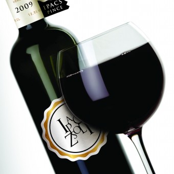
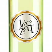
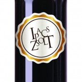
The main inspiration came right from the client’s wish to emphasize his name on the bottles. So the art director decided to use the letters as the logo itself. He strated plyaing with the name until such a beautifully composed logo was born.
UNIQUE PROPERTIES / PROJECT DESCRIPTION:
Ipacs Winery is a young, emerging, dynamic developing and already successful winery led by an ambitious owner.
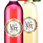
Our task was to design the CI and the packaging for the winery. Neither the package-technology nor the budget of Ipacs can rival with the historic wineries, thus the designer’s goal was to take advantage of the disadvantage. The quite unusual flag-like label was born thanks to this pressure. The label holds all important information so the tag on the bottle can concentrate exclusively on the branding.
OPERATION / FLOW / INTERACTION:
-
PROJECT DURATION AND LOCATION:
-
FITS BEST INTO CATEGORY:
Packaging Design
|
PRODUCTION / REALIZATION TECHNOLOGY:
-
SPECIFICATIONS / TECHNICAL PROPERTIES:
width: 70mm
height: 325mm
TAGS:
innovative label design, bottle, wine
RESEARCH ABSTRACT:
-
CHALLENGE:
-
ADDED DATE:
2010-07-06 00:03:32
TEAM MEMBERS (1) :
Mr. Attila Simon - creative director, Mr. Tamás Veress - art director
IMAGE CREDITS:
Esteemed Designer, 2010.
|


