DESIGN NAME:
Bright Side Goods
PRIMARY FUNCTION:
Corporate Identity
INSPIRATION:
The inspiration for Bright Side Goods' design came from blending eco-friendliness with modern style. Driven by the brand's commitment to sustainability and fashionable design, I aimed to craft a visual story that reflects these ideals. My research on sustainable design trends and what consumers like guided the creation of a design that combines environmental care with modern sophistication.
UNIQUE PROPERTIES / PROJECT DESCRIPTION:
The design merges sustainability with modern style, appealing to eco-aware consumers. The company creates home products using recycled and upcycled materials, making it more than just a brand—it's a commitment to the environment and design. Their mission is to blend eco-responsibility with visual appeal, forming a distinct identity that lessens environmental impact while enhancing home aesthetics.
OPERATION / FLOW / INTERACTION:
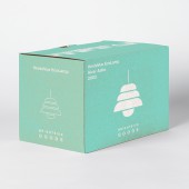
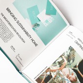
The design of Bright Side Goods ensures a smooth, unified experience across all platforms. From the first encounter on a business card to the website journey, it presents a cohesive brand image. The logo acts as a constant, guiding users through their interaction with the brand, whether online or in-store.
PROJECT DURATION AND LOCATION:
The project commenced and concluded in 2023, earning nominations for prestigious awards, including the IDA Gold, Muse Silver Award, and NYX Gold Awards.
FITS BEST INTO CATEGORY:
Graphics, Illustration and Visual Communication Design
|
PRODUCTION / REALIZATION TECHNOLOGY:
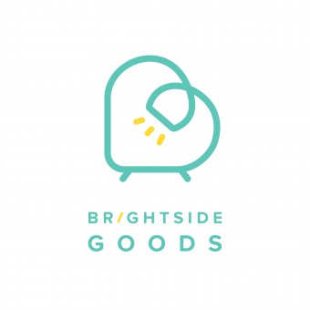
I aimed to capture the essence of Bright Side Goods, focusing on renewal, continuity, and a cozy home feeling. The logo combines a heart and the letter 'B', with integrated symbols of a sofa and lamp, representing comfort and light. These elements reflect the brand's dedication to sustainable, stylish living spaces. The heart symbolizes compassion and sustainability, while the 'B' directly represents Bright Side Goods. This logo is more than a symbol; it tells the story of the brand's commitment to enhancing homes with eco-friendly elegance and warmth.
SPECIFICATIONS / TECHNICAL PROPERTIES:
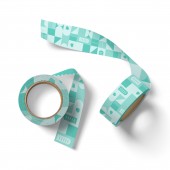
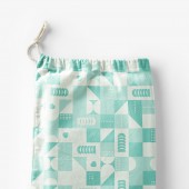
The visual identity of Bright Side Goods is designed to work well on different media, from big billboards to small phone screens. The logo can change size, being clear to read at 30mm wide for print and 60 pixels wide for digital use. The main blue color and white spaces are consistent in all uses, keeping the brand's look the same everywhere. The Proxima Nova font is used in various sizes, ensuring it’s easy to read both in print and online. Our design guidelines help make sure the logo, colors, fonts, and images stay consistent across all materials.
TAGS:
Sustainable Design, Visual Identity, Visual Communication, Brand Identity, Eco-friendly Branding
RESEARCH ABSTRACT:
I carried out surveys and studies, collecting information online and through interviews. The findings showed people prefer products that are eco-friendly and look good. This helped me create a design that matches these preferences, benefiting the business and supporting green design.
CHALLENGE:
The toughest part of creating the design for Bright Side Goods was finding the right balance between eco-friendliness and a modern, stylish appearance, ensuring it also resonated with market trends. I had to weigh the historical and social facets of sustainable design against contemporary aesthetics. I encountered challenges with environmental regulations and the quest for sustainable materials and methods compatible with the design.
ADDED DATE:
2024-03-30 01:19:04
TEAM MEMBERS (1) :
IMAGE CREDITS:
Illustrator Bilan Liu, 2023.
|
