Daiichi Hospital by Tetsuya Matsumoto |
Home > Winners > #161228 |
 |
|
||||
| DESIGN DETAILS | |||||
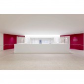
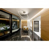
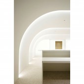
| DESIGN NAME: Daiichi PRIMARY FUNCTION: Hospital INSPIRATION: The design was inspired by its site. the shape of the available land area and its angular position toward the main road inspired the repetition of the main facade in several layers as a corner treatment that would be an eye catcher for the people driving along the road but also for the pedestrians walking by. The white color dominance is inspired by the cleanliness, the hygiene, and its psychological effect on the patients. UNIQUE PROPERTIES / PROJECT DESCRIPTION: The new replacement building for Himeji Daiichi Hospital is built next to the late 1960s block that is planned to be demolished after moving to the new building. The idea behind this project is to bring some modernity and lightness to the old institution and to change the heavy monolithic image of hospital buildings. This is done by creating a porous facade that is treated as a sheet and repeated to create the depth of the building. OPERATION / FLOW / INTERACTION: The entrance opens to the reception counter followed by to the waiting area that faces a series of consulting and treatment rooms. It also contains medical imaging area and an emergency area also accessible from a dedicated entrance. The second floor is occupied by the dialyzes room, operating area, and dispensing services. The following floors are for the inpatient rooms. The sixth floor houses the rehabilitation room, the kitchen and dining areas, and offices. The seventh floor is technical. PROJECT DURATION AND LOCATION: Project start: July 2018. Construction starts: December 2021. Project/Construction End: March 2023. Location: Himeji City, Japan. FITS BEST INTO CATEGORY: Architecture, Building and Structure Design |
PRODUCTION / REALIZATION TECHNOLOGY: The 7 stories building is supported by a grid of metallic beams and pillars. Since Japan is prone to earthquakes the building is design with extra safety measure. The facade is covered by cladding panels from KMEW. The interior is built using drywall techniques and was finished with a variety of materials including tiles, vinyl floor, vinyl wall cloth, wooden panels, platina panels, melamine board, and mirrors. SPECIFICATIONS / TECHNICAL PROPERTIES: Gross Built Area: 2239sqm W55100mm x D29777mm x H29910 TAGS: Japan, hospital, white, reception, green, architecture, interior, medical, clinic, reception RESEARCH ABSTRACT: The main challenge with this project is to break up with the monolithic block representative of modern hospitals and shift the interior towards a more anxiety free hospitality driven spaces. While aiming to achieve this the design needed to still obey the very strict healthcare functionality of a modern hospital and keep the tight budget under control. The available land area had an irregular shape creating efficiency complications that needed to be overcome. CHALLENGE: The challenge of this project is to design and build a fully functional 100 beds hospital that responds to the newest Japanese regulations regarding earthquake and fire safety, using a very limited budget and yet produce a space that tends more towards hospitality rather then medical. Finding the middle ground between small luxury, efficiency, cost effectiveness, limited footprint, and extremely regulated spaces. ADDED DATE: 2024-03-28 12:00:08 TEAM MEMBERS (1) : Tetsuya Matsumoto IMAGE CREDITS: Image #1: photographer ©Nacasa & partners Inc, Daiichi Hospital, 2023. Image #2: photographer ©Nacasa & partners Inc, Daiichi Hospital, 2023. Image #3: photographer ©Nacasa & partners Inc, Daiichi Hospital, 2023. Image #4: photographer ©Nacasa & partners Inc, Daiichi Hospital, 2023. Image #5: photographer ©Nacasa & partners Inc, Daiichi Hospital, 2023. |
||||
| Visit the following page to learn more: https://ktx.space/ | |||||
| AWARD DETAILS | |
 |
Daiichi Hospital by Tetsuya Matsumoto is Winner in Architecture, Building and Structure Design Category, 2023 - 2024.· Press Members: Login or Register to request an exclusive interview with Tetsuya Matsumoto. · Click here to register inorder to view the profile and other works by Tetsuya Matsumoto. |
| SOCIAL |
| + Add to Likes / Favorites | Send to My Email | Comment | Testimonials | View Press-Release | Press Kit |


