DESIGN NAME:
Light And Less
PRIMARY FUNCTION:
Office
INSPIRATION:
The office is in a shophouse. Its long side is about 7 meters, while the short side has many dark corners due to lighting. The designer reversed the traditional office layout and created an open office by focusing on lighting and dark corners. To improve the lighting, the designer set up a planting patio in the center. Natural light allows plants to grow, adding natural elements and vitality. In addition, most of the themed areas are designed to be flexible, allowing for lectures, events, meditation, etc.
UNIQUE PROPERTIES / PROJECT DESCRIPTION:
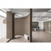
The design is based on three large curves to create the layout. Instead of traditional vertical partitions, the designer kept the space as open as possible to create natural circulation. This design gives the foyer, meeting room, and office areas a unique ambiance and emphasizes flexibility and mobility.
The designer used a patio to bring in natural light for the growth of plants. The planted patio brings in plenty of sunlight and a comfortable atmosphere of greenery, thus adding natural elements and vitality.
OPERATION / FLOW / INTERACTION:
User feedback on the project has been extremely positive, particularly in terms of innovative spatial planning and detailing. The well-designed proportions and scales, especially the view angle from the rear toilet to the wood grain grille, have enhanced users' sense of security. Adequate storage space and perfect office equipment to meet the staff's work needs. Staff said that the new office is much more spacious than before, and the lighting is also very bright so that they feel more comfortable and relaxed.
PROJECT DURATION AND LOCATION:
The project finished in February 2023 in Taiwan.
FITS BEST INTO CATEGORY:
Interior Space and Exhibition Design
|
PRODUCTION / REALIZATION TECHNOLOGY:
The interior facades are covered with a special paint that replaces the standard white walls. Six gradations of colors are applied according to the color ratio to create a warm and calm atmosphere. The floors are covered with high-quality, abrasion- and scratch-resistant stone plastic composite, whose warm wood grain is pleasing to the eye. The aesthetically fluid slant pattern enhances the space's extensibility and infinite possibilities and is oriented in the same direction as the planted patio.
SPECIFICATIONS / TECHNICAL PROPERTIES:
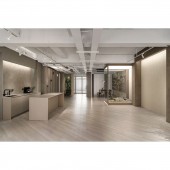
The site is an empty house with a total area of 254.5 square meters. The open plan includes a foyer, meeting room, office area, meditation area, and complex space. The layout incorporates many ingenious ideas. For example, the grille design of the doors and sliding doors serves as a boundary between private and social areas while maintaining a sense of openness and mobility. Three curves define the theme of each area while retaining flexibility. The wide multipurpose space is like a blank canvas, which can serve a variety of activities, expanding and exploring the various aspects of life.
TAGS:
Natural Lighting, Flexible Space, Planted Patio, Circular Design, Sustainable Materials
RESEARCH ABSTRACT:
The brightly lit floor-to-ceiling window area is the main office, serving the staff who provide creativity and value. Simplicity, a certain degree of privacy, flexibility, and a place to stimulate creativity are the ideal working conditions for Lightness. co. The curved wall separates different states: working, meditating, relaxing, reading, etc., while also allowing for possible expansion in the future. The designer preserved as much natural light as possible to reveal the original character of the space and the environment.
CHALLENGE:
The challenge was to fulfill a variety of needs such as events, lectures, exercises, etc. in a limited space. The project required a large event space and a movable, functional kitchen island. The next issue was to maintain integrity and aesthetics while maintaining flexibility. The designer's plan favors simplicity and seeks durability and consistency. Neutral colors and wood elements are complemented by lighting, planting, and furniture to create depth of field and meet the needs of display and activity.
ADDED DATE:
2024-03-27 05:11:24
TEAM MEMBERS (1) :
Jun-Rung Wu
IMAGE CREDITS:
Lightnless.co
|


