Journey To Fun Playful Hospital Wayfinding by Seevinck Baade Miller Seear Douglas |
Home > Winners > #161077 |
 |
|
||||
| DESIGN DETAILS | |||||
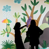
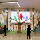
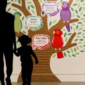
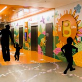
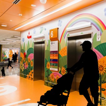
| DESIGN NAME: Journey To Fun PRIMARY FUNCTION: Playful Hospital Wayfinding INSPIRATION: Nature, children's games, collaboration with hospital stakeholders and the building's 'living tree' concept and parrot sculptures were key.Biophilic design and regional landscape led to nature-based placemaking at each entry point (Lifts A,B).Playful characterisations of parrots could relate to children and 3 unique parrots were created for each of the 3 services, using coloured feather trails and inspired by playground games like Hopscotch - immediately facilitating active and embodied play. UNIQUE PROPERTIES / PROJECT DESCRIPTION: Queensland Children's Hospital needed to enhance their Entertainment Precinct’s branded identity; facilitate a joyful experience within that distracts families from illness; and improve its wayfinding for locating services. We addressed this through uniquely incorporating playground games into wayfinding; and visual design that complements and integrates with architecture and environment. Our co-design and interdisciplinary approach with stakeholders, key to the project success, is also unique. OPERATION / FLOW / INTERACTION: The design utilizes wayfinding and UX design to tackle challenges like getting lost and limited engagement. Memorable landmarks created at lift wells aid recollection, with places (waterfall) replacing letters (lift A). Directional signage includes the parrot signage at the intersections near lift entries and the playfully directional feather trails on the floors. Colour and symbols (parrots, feathers) in the signage differentiates between destinations, while also uniquely representing each PROJECT DURATION AND LOCATION: Starting October 2020 with co-design, research and prototyping, the concepts and imagery were refined by July 2021, then vectorized, with final approvals, printing and installation by September 2021. Publicly launched in October it remains a significant and impactful part of the Queensland Children’s Hospital, the primary facility of Queensland’s state-wide Hospital and Health Service, with over 350 beds, 40,000 patients annually, and according to Newsweek, the 10th best children's hospital internationally. FITS BEST INTO CATEGORY: Graphics, Illustration and Visual Communication Design |
PRODUCTION / REALIZATION TECHNOLOGY: Co-design workshops with hospital stakeholders resulted in insights such as the parrot character. Using site photos and Photoshop, digital collages were created for feedback. Detailed wall and doorway measurements were taken to create layout templates. Paper and Procreate were used for illustration, with vectorizing in Illustrator. Vertical designs were printed as wall-sized panels and floor feather decals were individually die cut and installed. SPECIFICATIONS / TECHNICAL PROPERTIES: 226 Square meters of visual design cover the walls of the Entertainment Precinct, ranging from 2.7m to 3.1m high, and 7.5m pillar. A further 270 square meters of floor space feature lines of feather decals for playfully directional signage. The design distinguishes between two entry/exit points (lifts A, B), three destinations (the services), three intersections for direction and the pillar as a landmark. A one-hour video with animated elements (winking, feather rustle) complements the design. TAGS: Design for Health, Co-Design, Collaboration, Hospital Wayfinding, Hospital Branding, Experience Design, Wayfinding, Branding, Environmental Graphic Design, Hospital, Pediatric RESEARCH ABSTRACT: Level 6 'Entertainment Precinct' needed a distinctive, joyful identity and improved wayfinding. Design was informed by collaborative and human-centered methods, from co-design workshops to interviews and surveys. Post-completion feedback is overwhelmingly positive: one mother shared how her toddler, typically reluctant to walk, eagerly followed the feathers, demonstrating the design's positive impact on wellbeing. Our solution surpassed expectations and informs ongoing design and research. CHALLENGE: Designing within health and architectural constraints was exciting and a challenge. Our interdisciplinary team navigated challenges to integrate playful UX into wayfinding, considering factors from surface sterilization to inclusive design and complementing the orange colour scheme. Striving to 'escape flatland,' we used floor decals to encourage physical engagement akin to playground activities. Parrot characters peeked over doors, adding humor and enriching the playful experience design. ADDED DATE: 2024-03-22 04:41:41 TEAM MEMBERS (6) : Chief Investigator & Designer: Jen Seevinck , Artist: Kirsten Baade , Chief Investigator: Evonne Miller , Investigator: Gillian Ridsdale, Investigator: Matthew Douglas and Investigator: Lynne Seear IMAGE CREDITS: Image #1 : Photographer Sarah Osborne, Illustration Kirsten Baade, Documentation, 2021 Image #2 : Photographer Sarah Osborne, Illustration Kirsten Baade, Documentation, 2021 Image #3 : Photographer Sarah Osborne, Illustration Kirsten Baade, Documentation, 2021 Image #4 : Photographer Sarah Osborne, Illustration Kirsten Baade, Documentation, 2021 Image #5 : Photographer Sarah Osborne, Illustration Kirsten Baade, Documentation, 2021 |
||||
| Visit the following page to learn more: https://tinyurl.com/bddmwakj | |||||
| AWARD DETAILS | |
 |
Journey to Fun Playful Hospital Wayfinding by Seevinck Baade Miller Seear Douglas is Winner in Graphics, Illustration and Visual Communication Design Category, 2023 - 2024.· Press Members: Login or Register to request an exclusive interview with Seevinck Baade Miller Seear Douglas. · Click here to register inorder to view the profile and other works by Seevinck Baade Miller Seear Douglas. |
| SOCIAL |
| + Add to Likes / Favorites | Send to My Email | Comment | Testimonials | View Press-Release | Press Kit |

