Inmyes Branding Project by Chungsheng Chen and Jinhe Wang |
Home > Winners > #161001 |
 |
|
||||
| DESIGN DETAILS | |||||
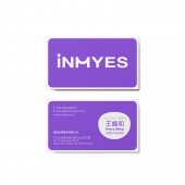
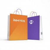
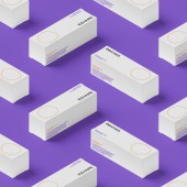
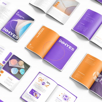
| DESIGN NAME: Inmyes PRIMARY FUNCTION: Branding Project INSPIRATION: The brand developed from an OEM lenses manufacture company who which to transform into branded business with a fresh image. Positioning itself with a vibrant yet professional image, aiming to differentiate from international brands and strengthen its international marketing efforts. Leveraging over 30 years of expertise in lens development and optical knowledge, future marketing strategies will target various eyewear and optical markets with different lens options. UNIQUE PROPERTIES / PROJECT DESCRIPTION: The name derived from the abbreviation of in my eyes, it showed the concept of viewing the world from a personal perspective. Its outstanding technology, which can broaden perspectives through its products and bring people closer together. The brand name initial i in lowercase to emphasize that it belongs to me, the deformed letter M show a handshake image, is the mutual trust between brand and its customers. Brand tone brings out the superior technology, positive energy and professional fashion OPERATION / FLOW / INTERACTION: The logo can be applied to various platforms such as eyeglass cases, business cards, packaging, websites, and social media. By maintaining consistency across different media, the brand image is ensured while enhancing exposure and recognition. Eyeglass cases and packaging serve as direct applications, while websites and social media platforms are primary channels for interacting and communicating with consumers. Displaying the brand logo in these places effectively reinforces consumer impressions, increases brand recognition, and attractiveness. PROJECT DURATION AND LOCATION: The project commenced in 2020 and concluded in 2021, Tainan, Taiwan. FITS BEST INTO CATEGORY: Graphics, Illustration and Visual Communication Design |
PRODUCTION / REALIZATION TECHNOLOGY: The logo was designed using Adobe Illustrator, while the animation was created using Adobe Premium and Adobe After Effects. In terms of color, options of RGB, CMYK, and Pantone are provided to ensure consistent color appearance across various media platforms. SPECIFICATIONS / TECHNICAL PROPERTIES: Minimum height of the logo: 4 mm TAGS: Branding, Visual Identity, Logo Design, Lenses, Eyeglass RESEARCH ABSTRACT: iNMYES inherits the excellent technology of Bin Vision and utilizes iNMYES-developed lenses to provide clearer and wider vision, echoing the core spirit conveyed by "in my eyes". CHALLENGE: Naming the brand was a challenge, requiring a memorable name that integrates the characteristics of eyeglass lenses and infrared blocking into the logo design. Thus, iNMYES was born—a unique name with no duplicates in other industries. The brand aims to set an industrial new standard for eyeglass lenses for research and medical technology needs, blending vitality with fashion taste, and offering diverse eyewear choices across various fields. ADDED DATE: 2024-03-19 13:33:54 TEAM MEMBERS (7) : ChungSheng Chen, JinHe Wang, TingYuan Lin, WanYun Lo, Tainan University of Technology/Product Design Department, Acdesign Associates International Co.,Ltd and Bin Shyh Enterprise Co.,Ltd. IMAGE CREDITS: Logo Copyright/ Bin Shyh Enterprise Co.,Ltd. |
||||
| Visit the following page to learn more: https://zh.inmyes.com/ | |||||
| AWARD DETAILS | |
 |
Inmyes Branding Project by Chungsheng Chen and Jinhe Wang is Winner in Graphics, Illustration and Visual Communication Design Category, 2023 - 2024.· Press Members: Login or Register to request an exclusive interview with Chungsheng Chen and Jinhe Wang. · Click here to register inorder to view the profile and other works by Chungsheng Chen and Jinhe Wang. |
| SOCIAL |
| + Add to Likes / Favorites | Send to My Email | Comment | Testimonials | View Press-Release | Press Kit |
| COMMENTS | ||||
|
||||

