Judinstrom Beer Packaging by Olha Takhtarova |
Home > Winners > #160960 |
 |
|
||||
| DESIGN DETAILS | |||||
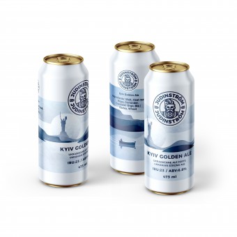
| DESIGN NAME: Judinstrom Beer PRIMARY FUNCTION: Packaging INSPIRATION: The Judinstrom brand was created from scratch to enter the Canadian beer market and elevate the status of a local brewery from Montreal. It also sought to cultivate a specific beer consumption culture and introduce consumers to different styles of the beverage. The task included creating a logo, visual elements, and packaging design for craft beer using Scandinavian motifs but in a modern interpretation. UNIQUE PROPERTIES / PROJECT DESCRIPTION: Judinstrom is a small craft brewery located in Montreal, QC Canada. Judinstrom Beer is brewed with respect to Belgian brewing traditions with notes of Ukrainian nature. Light barley, wheat, and caramel malts, along with modern hop varieties, create fruity and hoppy aromas in addition to a bright, balanced sweet, and dense body. Craft brewery Judinstrom produces beer of various styles with additions of spices, fruit purees, and other natural ingredients. OPERATION / FLOW / INTERACTION: Over time, 6 more beer styles will be added to the lineup. Therefore, a minimalist design with a unified core was created, which, through changes in details and placement of associative items, will emphasize and intuitively distinguish each beer flavor. The logo serves as the visual foundation for the entire beer lineup, ensuring unity and brand recognition. The design is simple and clean to avoid distracting consumers from the main idea and to create a cohesive look for the beer lineup. PROJECT DURATION AND LOCATION: The project started in June 2023 in Montreal, QC Canada and Finished in September 2023 FITS BEST INTO CATEGORY: Packaging Design |
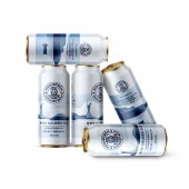
PRODUCTION / REALIZATION TECHNOLOGY: Standard aluminum can 473 ml, Flexography. SPECIFICATIONS / TECHNICAL PROPERTIES: Label size 5 x 8 inches. TAGS: Beer Packaging, Scandinavian design, Label, Craft brewery RESEARCH ABSTRACT: The design incorporates deep blue, shades of gray, and white for contrast and highlighting details. This palette creates an atmosphere of coldness and resilience, characteristic of Scandinavia. Illustrations in a flat graphic style are used on the packaging, creating a minimalist design. A font with straight lines and angles is chosen to complement the graphic elements of the packaging. Additionally, information about the brand, beer type, alcohol content, etc., is placed on the packaging in a way that is readable and does not disrupt the overall design. CHALLENGE: Working on creating a craft beer brand in a modern Scandinavian style requires careful planning and attention to detail to achieve the desired result. It is necessary to find the right balance between modern design and traditional Scandinavian motifs so that the packaging looks contemporary while still maintaining a connection to the region's cultural heritage. Defining a color palette that conveys characteristic traits of the Scandinavian style, such as coldness and restraint, can be challenging. It is important to coordinate graphic elements with text on the packaging in a way that ensures information is readable and does not detract from the overall visual impression. ADDED DATE: 2024-03-17 19:37:14 TEAM MEMBERS (1) : IMAGE CREDITS: Olha Takhtarova, 2023. |
||||
| Visit the following page to learn more: https://sotdesign.com/en | |||||
| AWARD DETAILS | |
 |
Judinstrom Beer Packaging by Olha Takhtarova is Winner in Packaging Design Category, 2023 - 2024.· Press Members: Login or Register to request an exclusive interview with Olha Takhtarova. · Click here to register inorder to view the profile and other works by Olha Takhtarova. |
| SOCIAL |
| + Add to Likes / Favorites | Send to My Email | Comment | Testimonials | View Press-Release | Press Kit |


