DESIGN NAME:
Extra Melty Upgrade
PRIMARY FUNCTION:
Mint Package
INSPIRATION:
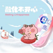
The inspiration came from the insight that modern consumers face increasing stress in their daily lives, which builds up over time like a snowball. The brand aims to be the key to melt these stress, hence the concept of 'melting snow'. The design solution seeks to evoke pleasure and relaxation through playful characters and dynamic visuals, creating a positive consumer experience.
UNIQUE PROPERTIES / PROJECT DESCRIPTION:
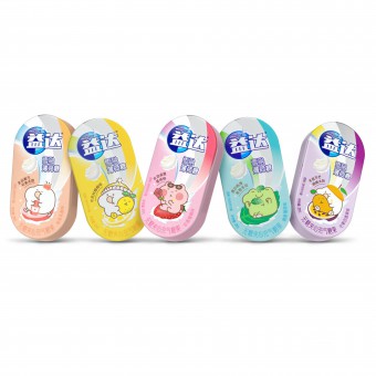
Our design concept revolved around the idea of 'melting snow', symbolizing the stress-relieving properties of the product.
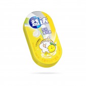
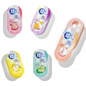
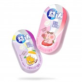
It was requested to retain recognizable brand elements such as the Extra logo and the swoosh, hence we visually evolved the swoosh into a ski run, creating a scene for the cartoon character to have fun, echoing the theme of melting snow.
You will notice that the fruit plays not only a flavor cue, but also a vivid snowboard that completes the storytelling.
We would imagine that at the moment of tasting the mints, an alpine skiing-like experience will emerge in consumers' mouths and minds.
OPERATION / FLOW / INTERACTION:
-
PROJECT DURATION AND LOCATION:
6 months in Shanghai,China
FITS BEST INTO CATEGORY:
Packaging Design
|
PRODUCTION / REALIZATION TECHNOLOGY:
-
SPECIFICATIONS / TECHNICAL PROPERTIES:
-
TAGS:
IP integration, Visual assets enhancement, Brand identity, Consumer interaction
RESEARCH ABSTRACT:
-
CHALLENGE:
We were challenged to interpret the existing brand assets from the abstract 'swoosh' to meaningful and easily echoable elements. We explored different possibilities, taking into account brand personality, consumer preferences and local trends, and worked with the branding team on the final touches.
ADDED DATE:
2024-03-13 09:09:41
TEAM MEMBERS (1) :
IMAGE CREDITS:
ShinyBay Design
|


