Fruit Bar Snack Packaging by Olha Takhtarova |
Home > Winners > #160663 |
 |
|
||||
| DESIGN DETAILS | |||||
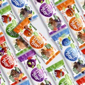
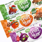
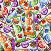
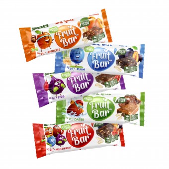
| DESIGN NAME: Fruit Bar PRIMARY FUNCTION: Snack Packaging INSPIRATION: Our task was to create a new brand and packaging that would convey authentic taste and modern individuality. Moreover, this new brand should communicate closely and boldly with young people. A bright voluminous logo and illustrations were developed in the form of characters, each of which is associated with a certain fruit. These characters express individuality, positivity, and pure energy, making them attractive and memorable for consumers UNIQUE PROPERTIES / PROJECT DESCRIPTION: Fruit Bar is a new brand of quick and nutritious snacks. Our products are made exclusively from natural ingredients: nuts, fruits, and seeds. There are no harmful additives, artificial flavor enhancers, dyes, or preservatives in our snacks. The company aims to stand out among other health-oriented snack brands by conveying a sense of joy and utility. It was necessary to express this energy and joy of Fruit Bar through packaging that will be attractive and easily recognizable among other brands. OPERATION / FLOW / INTERACTION: The developed packaging design for Fruit Bar interacts with the consumer through several key aspects: Attractiveness: Bright colors, interesting graphic elements, and an appealing packaging design can catch the consumer's attention on the store shelf or in advertisements. Informativeness: The design includes information about the product, such as its ingredients, nutritional value, health benefits, etc., helping the consumer make a purchasing decision. Emotional impact: Characters, colors, and the overall atmosphere of the packaging can evoke specific emotions in the consumer, such as joy, energy, or confidence in choosing the product. Brand recognition: Well-designed packaging can help reinforce brand recognition and create loyalty among consumers. PROJECT DURATION AND LOCATION: Poland. The project began in January 2023 and ended in June 2023 FITS BEST INTO CATEGORY: Packaging Design |
PRODUCTION / REALIZATION TECHNOLOGY: The characters on the packaging not only give it uniqueness but also fill customers with positivity and energy. They become an integral part of the brand, which aims to convey joy and dynamism to its consumers. For example, the fig character, brightly purple, is boxing and full of energy, while the apricot character, bright orange, is cheerful and into fitness. The plum character loves yoga, and the date character doesn't mind spending all their time in the pool. SPECIFICATIONS / TECHNICAL PROPERTIES: Apricot, Figs, Plum, Dates, Multifruit - packing size 140 x 130 mm TAGS: Snack, Snack bar packaging, Fruit Bar, Illustration, Characters RESEARCH ABSTRACT: To emphasize the charismatic character of the brand and the attractiveness of the packaging, we used bright and expressive colors that reflect the taste of the product while also distinguishing the range. We employed gradient stretches in purple, bright orange, green, blue, and red hues. Additionally, an individual logo was created for each product, giving it a distinctive and direct style to help consumers easily identify each product line CHALLENGE: Before starting the development of the Fruit Bar packaging, research was conducted on the target audience, their needs, and preferences. Close competitors and recent packaging design trends were also reviewed. Choosing suitable packaging materials was crucial; it needed to provide protection for the product from external factors and be made from environmentally friendly materials to support the latest eco-friendly trends and demands. A challenge arose in creating a design that was both attractive and informative while providing enough space for necessary product information. ADDED DATE: 2024-03-07 21:34:44 TEAM MEMBERS (1) : IMAGE CREDITS: Olha Takhtarova, 2023. |
||||
| Visit the following page to learn more: https://sotdesign.com/en | |||||
| AWARD DETAILS | |
 |
Fruit Bar Snack Packaging by Olha Takhtarova is Winner in Packaging Design Category, 2023 - 2024.· Press Members: Login or Register to request an exclusive interview with Olha Takhtarova. · Click here to register inorder to view the profile and other works by Olha Takhtarova. |
| SOCIAL |
| + Add to Likes / Favorites | Send to My Email | Comment | Testimonials | View Press-Release | Press Kit |


