January Uprising Catalog of Documents by Izabela Jurczyk |
Home > Winners > #160413 |
 |
|
||||
| DESIGN DETAILS | |||||
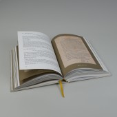
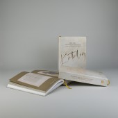
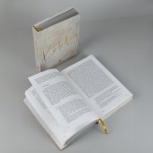
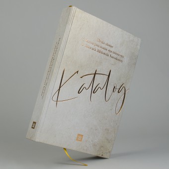
| DESIGN NAME: January Uprising PRIMARY FUNCTION: Catalog of Documents INSPIRATION: The inspiration for the choice of colors, which are the main element of the design, was the snow shimmering in the sun, reminiscent of the once snowy January in Poland – crystal clear in places, soiled in others. The golden frames of the illustrations reflect the formal, royal character of the prints, most of which concern the operation of a national institution called the secret Polish state in the Kingdom of Poland under Russian rule. The purpose of displaying everyday documents in this way was to recognize their official, state character – contrast was used to show that the gray prints presented in the catalog had "royal" significance for the Polish nation and were an expression of the still existing state structure. Ceremonial treatment of these prints owed to official documents shows their role in maintaining hope in the nation and the continuity of the state. The handwritten subtitle "Katalog" on the cover emphasizes the personal nature of this collection of prints, in the sense of being close to everyday life and close to the hearts of Poles living under foreign rule. UNIQUE PROPERTIES / PROJECT DESCRIPTION: Book is a catalog of unique documents of everyday social life from the period of the Polish national uprising against the annexation of Poland by the Russian Empire in January 1863. It was the largest and longest national uprising in Poland (as well as in Lithuania and parts of Belarus) – it collapsed in the fall of 1864. The catalog was issued as an anniversary publication on the 160th anniversary of the outbreak of the uprising. The ceremonial nature of the publication was emphasized by the gold color (which is also reminiscent of the shimmering January snow), hardcover and golden panels, making the illustrations look like paintings in a passe-partout or golden frame. Thanks to the large number of illustrations and the way they are displayed, leaflets obtain an unexpected form – modest prints become works of art presented in an art gallery. OPERATION / FLOW / INTERACTION: First of all, the publication is a souvenir of the national uprising that was very difficult for Poles, a commemoration of their efforts, and a reminder of the 160th anniversary of the uprising. This character is immediately visible thanks to the form of the publication – a hard cover and a book block printed with 10 liters of Pantone gold color. This conventionally ceremonial way of celebrating an important national event is balanced by the mundane nature and physical ordinariness of the presented prints, which are not decorative, impressive writings, but documents created in secret printing houses, distributed secretly, transmitting information from the bottom up that, under normal conditions in the country, is communicated from above. This tension between the everyday and the ceremonial, between the pure white and the worn-out gray is the most important sensation the reader is to experience. Moreover, the description of the prints is presented in an extremely clear manner. Some of the descriptions repeat the text visible on the prints, which brings the reader even closer to the content and introduces him to the world of the institutional and social reality of Poles under Russian rule. PROJECT DURATION AND LOCATION: The project started in September 2023 in Lodz and finished in December 2023 in Warsaw |
PRODUCTION / REALIZATION TECHNOLOGY: Hardcover, embossed with gold foil. CMYK and pantone gold printed SPECIFICATIONS / TECHNICAL PROPERTIES: 175 mm x 36 mm x 245 mm TAGS: book, poland, uprising, leaflets RESEARCH ABSTRACT: - CHALLENGE: - ADDED DATE: 2024-03-04 15:19:43 TEAM MEMBERS (1) : IMAGE CREDITS: Image #1: Photographer Robert Bobryk Image #2: Photographer Robert Bobryk Image #3: Photographer Robert Bobryk Image #4: Photographer Robert Bobryk Image #5: Photographer Robert Bobryk |
||||
| Visit the following page to learn more: https://bitly.ws/3eZ2I | |||||
| AWARD DETAILS | |
 |
January Uprising Catalog of Documents by Izabela Jurczyk is Winner in Print and Published Media Design Category, 2023 - 2024.· Press Members: Login or Register to request an exclusive interview with Izabela Jurczyk. · Click here to register inorder to view the profile and other works by Izabela Jurczyk. |
| SOCIAL |
| + Add to Likes / Favorites | Send to My Email | Comment | Testimonials | View Press-Release | Press Kit |

