Ukd Catalog by Izabela Jurczyk |
Home > Winners > #160411 |
 |
|
||||
| DESIGN DETAILS | |||||
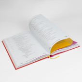
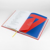
| DESIGN NAME: Ukd PRIMARY FUNCTION: Catalog INSPIRATION: The inspiration was the desire to break with the greyness, uniformity and blandness of previous Ukd publications and the paintings of Mark Rohtko with their color. Catalog is used in every library. Until now, searching for a given field required browsing through the entire publication or going back to the table of contents. The choice of vivd colors for field division refers to the division of physical space into bookshelves. Using publications is like navigating through a real library. UNIQUE PROPERTIES / PROJECT DESCRIPTION: Ukd serves to catalog texts depending on the fields and disciplines of science, culture and human activity. The modern Ukd design clearly divides the fields, which is the most important element in the structure of the publication and the cataloging process - hence the colorful, large dividers on mass-dyed paper. Clear labeling of domain symbols and the arrangement of these symbols within paragraphs allows you to quickly understand how these symbols are created. OPERATION / FLOW / INTERACTION: When librarians take the book in their hands, they immediately know that they are dealing with a new edition of the Ukd tables – so different is this edition from the previous ones. They also see its structure immediately, even before opening the publication. After a short use, the librarian learns what colors are associated with particular fields and can immediately open the publication on the part that interests him. Thanks to the contrast with the thin paper of the book block, the thick paper of the double dividers makes it easier to find the place where a given field begins. Large cards with numbers make the field symbol immediately visible, which is important when the librarian creates symbols describing a given book. The name of the field is also displayed separately on a smaller divider, beautifully contrasting with the large one and creating color harmony. The hardcover ensures greater durability of the publication, opened and closed many times and transferred by librarians to the shelves where the books are placed. The format of the publication remains the same as in previous editions, as does the paper of the book block. The layout of the content - symbols on the left, description on the right - makes it easier to find subsequent subfields and clearly shows how symbols are created for lower-level categories. PROJECT DURATION AND LOCATION: The project started in July 2019 in Lodz and finished in November 2019 in Warsaw |
PRODUCTION / REALIZATION TECHNOLOGY: Hardcover, embossed with silver foil. Inserts made of various decorative papers. CMYK and pantone printed SPECIFICATIONS / TECHNICAL PROPERTIES: 215 mm x 36 mm x 310 mm TAGS: book, publication, disciplines, catalog, science, culture RESEARCH ABSTRACT: - CHALLENGE: A major complication was the bookbinding, workmanship and material aspects of the publication, combined with the high circulation. The interleave pages had to be cut and sewn-in separately and manually, which prolonged and complicated the entire production process. Similarly difficult was the selection of Pantone colors for screen printing on mass-dyed paper and the best possible repetition of the color of the mass-dyed paper in the Pantone color of the digits symbolizing the field. ADDED DATE: 2024-03-04 14:54:16 TEAM MEMBERS (1) : IMAGE CREDITS: Image #1: Photographer Robert Bobryk Image #2: Photographer Robert Bobryk Image #3: Photographer Robert Bobryk Image #4: Photographer Robert Bobryk Image #5: Photographer Robert Bobryk |
||||
| Visit the following page to learn more: https://bitly.ws/3eZ2I | |||||
| AWARD DETAILS | |
 |
Ukd Catalog by Izabela Jurczyk is Winner in Print and Published Media Design Category, 2023 - 2024.· Read the interview with designer Izabela Jurczyk for design Ukd here.· Press Members: Login or Register to request an exclusive interview with Izabela Jurczyk. · Click here to register inorder to view the profile and other works by Izabela Jurczyk. |
| SOCIAL |
| + Add to Likes / Favorites | Send to My Email | Comment | Testimonials | View Press-Release | Press Kit |
| COMMENTS | ||||
|
||||


