Italian Pasta Brand Packaging by Olha Takhtarova |
Home > Winners > #160328 |
 |
|
||||
| DESIGN DETAILS | |||||
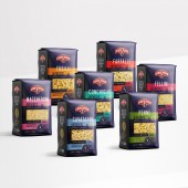
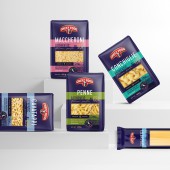
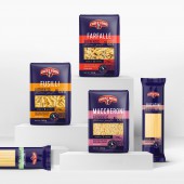
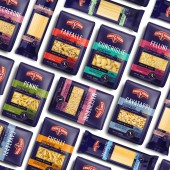
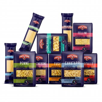
| DESIGN NAME: Italian Pasta Brand PRIMARY FUNCTION: Packaging INSPIRATION: The visual identity of Chefz Food is characterized by vibrant colors and clear zoning. The color palette includes a deep blue color that unifies all elements in the packaging design into a cohesive whole. Bold and bright shades of orange, coral, purple, green, and blue effectively distinguish the product on the shelf, help differentiate individual items in the product line, and stand out favorably against competitors. UNIQUE PROPERTIES / PROJECT DESCRIPTION: The project aimed to create a unique brand that would appeal to the main target audience and attract a new, younger audience. The task was to incorporate the image of traditional pasta-making methods and modern challenges and innovations into the visual identity and packaging design. This design should stand out in the competitive market of pasta products not just because of its aesthetics, but also because it embodies the brand's core values and attractiveness. OPERATION / FLOW / INTERACTION: Packaging should be convenient and attractive to the target audience. This requires analyzing the audience, market and competitors. The values and style of Chefz Food are reflected in the unique logo with the image of the chef. This character represents the brand and communicates with consumers, creating connections. "Engraved" logo emphasizes tradition and quality, setting the product apart. The packaging is visually appealing, informative and provides easy recognition of the contents. PROJECT DURATION AND LOCATION: Dubai, UAE the project began in September 2022 and ended in March 2023 FITS BEST INTO CATEGORY: Packaging Design |
PRODUCTION / REALIZATION TECHNOLOGY: The packaging for Italian pasta emphasizes its high quality and premium nature through attractive design and top-tier materials. It includes essential information like cooking instructions and nutritional details while employing vibrant colors and quality printing. Gold Pantone color adds a luxurious touch, enhancing perceived value. Moreover, the packaging is eco-friendly, using recyclable materials. SPECIFICATIONS / TECHNICAL PROPERTIES: Penne, Conchiglie, Farfallei, Cavatappi, Felinni, Fusilli, Macceroni- packing size 340 x 270 mm Linguine, Spaghetti, Bucatini - packing size 300 x 120 mm Marinara Sauce, Tomato Basil - sticker 30 x 70 mm TAGS: packaging, pasta, Italy, food packaging RESEARCH ABSTRACT: The work on the new brand of pasta products began with Market and competitor analysis, identifying trends and consumer needs. The target audience was defined, along with their preferences and behavioral characteristics. Next, the stage of creating a unique brand image and aesthetically appealing and informative packaging design that corresponds to the brand and attracts consumers' attention follows. CHALLENGE: Creating impressive packaging for each variant of pasta required collaborative work on an attractive and practical design. It was expected that this approach would grab customers' attention and make it easy to identify the contents of each package. The main goal was to blend beauty and utility, creating packaging that is both visually appealing and informative. Font selection was also considered to facilitate quick understanding of the key features of the packaging and provided information. This carefully thought-out approach not only enhances visual appeal but also ensures quick and informative understanding of the contents. ADDED DATE: 2024-03-02 20:33:58 TEAM MEMBERS (1) : IMAGE CREDITS: Olha Takhtarova, 2023. |
||||
| Visit the following page to learn more: https://sotdesign.com/en | |||||
| AWARD DETAILS | |
 |
Italian Pasta Brand Packaging by Olha Takhtarova is Winner in Packaging Design Category, 2023 - 2024.· Press Members: Login or Register to request an exclusive interview with Olha Takhtarova. · Click here to register inorder to view the profile and other works by Olha Takhtarova. |
| SOCIAL |
| + Add to Likes / Favorites | Send to My Email | Comment | Testimonials | View Press-Release | Press Kit |

