Orico Training Center Corporate Office by Nobuaki Miyashita |
Home > Winners > #160308 |
 |
|
||||
| DESIGN DETAILS | |||||
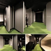
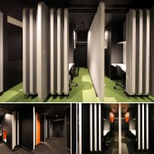
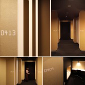
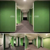
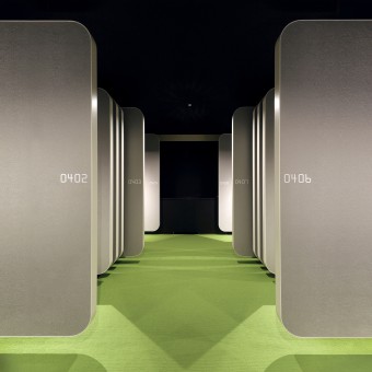
| DESIGN NAME: Orico Training Center PRIMARY FUNCTION: Corporate Office INSPIRATION: Credit cards are typically categorized into ranks such as normal, gold, and platinum, and there are also numerous cards specialized for hobbies like travel and dining. We drew inspiration from the unique worlds each of these individual cards connects to, each differing from the next. We attempted a design that expresses the different worldviews, or infinite universes, that just one card can unfold. UNIQUE PROPERTIES / PROJECT DESCRIPTION: To ensure that trainees can fully experience Orico's identity throughout the space, the design of guest rooms and common areas incorporates partitions that replicate the precisely defined shape of a credit card (including the corner radius and thickness), creating a multi-layered separation. The signage for room numbers and floor information employs the credit card-specific international standard font (Farrington 7B) for its design. OPERATION / FLOW / INTERACTION: Orico's training is planned in a shared room for eight, using card-type partitions in private areas to ensure privacy. In response to COVID-19, Orico has adapted the design to allow the center's use as both a satellite and touch-down office. This included enlarging individual desk spaces, incorporating task lighting, and selecting chairs with casters designed for extended periods of desk work, enhancing both functionality and comfort. PROJECT DURATION AND LOCATION: This project was completed in March 2021. The planned location is situated in a tranquil residential area in Tokyo, adjacent to lush green parks and university campuses. FITS BEST INTO CATEGORY: Interior Space and Exhibition Design |
PRODUCTION / REALIZATION TECHNOLOGY: The card partition walls are designed to detach from the ceiling and floor, creating a cantilevered structure that makes them appear to float lightly, expressing a dynamism as if countless cards are freely sliding and moving within the space. The ceiling gap also serves to comply with building codes for natural smoke extraction. Lighting uses a 50φ glare-less type to reduce its presence, making the card surfaces vividly stand out. SPECIFICATIONS / TECHNICAL PROPERTIES: Site area: 1,143.85 m2 Building area: 758.56 m2 Total floor area: 2,397.59 m2 Number of floors: Basement 1 floor, Ground 4 floors B1 floor: 126.64 m2 1st floor: 382.21 m2 2nd floor: 434.84 m2 3rd floor: 306.59 m2 4td floor: 306.59 m2 Height: Maximum height 17.75 m Structure: RC TAGS: Credit card,Accommodation,T RESEARCH ABSTRACT: Research Objective: To innovate the spatial image at low cost while utilizing existing RC structures and facilities such as air conditioning systems. Result: A space filled with identity was completed by reflecting Orico's VI in the design. Impact: It was renovated as a training facility with high employee satisfaction. CHALLENGE: We feared that creating complete individual spaces for each of the eight people in a single room would cut off communication. Inspired by the traditional Japanese architectural techniques of Fusuma and Shoji which allow for the presence to be felt while blocking the line of sight in a large room, a partition motif based on credit cards was devised to achieve this. ADDED DATE: 2024-03-02 01:53:42 TEAM MEMBERS (1) : IMAGE CREDITS: Image #1-#5: Photographer Nobuaki Miyashita, Variations, 2021 |
||||
| Visit the following page to learn more: https://prtimes.jp/main/html/rd/p/000000 |
|||||
| AWARD DETAILS | |
 |
Orico Training Center Corporate Office by Nobuaki Miyashita is Winner in Interior Space and Exhibition Design Category, 2023 - 2024.· Press Members: Login or Register to request an exclusive interview with Nobuaki Miyashita. · Click here to register inorder to view the profile and other works by Nobuaki Miyashita. |
| SOCIAL |
| + Add to Likes / Favorites | Send to My Email | Comment | Testimonials | View Press-Release | Press Kit |

